
![‘Snowtown’ Unpacks the Brutal “Bodies in the Barrels” Case [Murder Made Fiction Podcast]](https://bloody-disgusting.com/wp-content/uploads/2025/03/Snowtown-2011.jpeg)
![Lifetime’s ‘Trapped in Her Dorm Room’ Tackles Toxic Male Entitlement [Review]](https://bloody-disgusting.com/wp-content/uploads/2025/03/Trapped-in-Her-Dorm-Room-2025.jpg)


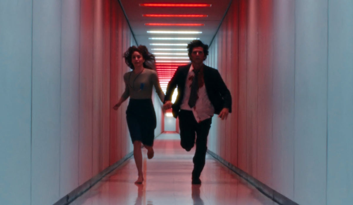
![Bill Skarsgård's Thriller Locked Went Above And Beyond To Maximize Its Primary Location [Exclusive]](https://www.slashfilm.com/img/gallery/bill-skarsgrds-thriller-locked-went-above-and-beyond-to-maximize-its-primary-location-exclusive/l-intro-1742587986.jpg?#)


![How To Turn An Airline Meal Voucher Into A Starbucks Gift Card—Or Use It To Earn Miles [Roundup]](https://viewfromthewing.com/wp-content/uploads/2023/06/20230619_080120.jpg?#)


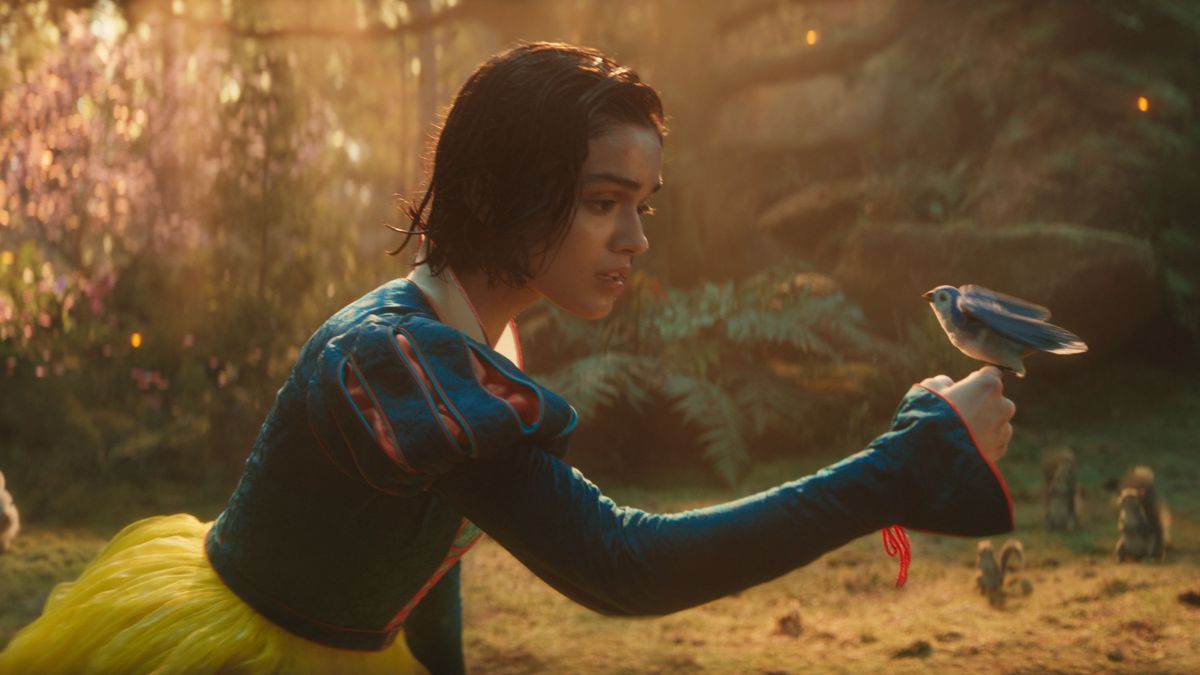
.jpg?width=1920&height=1920&fit=bounds&quality=80&format=jpg&auto=webp#)


.png?#)


.jpg)


![[Podcast] Should Brands Get Political? The Risks & Rewards of Taking a Stand with Jeroen Reuven Bours](https://justcreative.com/wp-content/uploads/2025/03/jeroen-reuven-youtube-1.png)
![[Podcast] Should Brands Get Political? The Risks & Rewards of Taking a Stand with Jeroen Reuven](https://justcreative.com/wp-content/uploads/2025/03/jeroen-reuven-youtube.png)


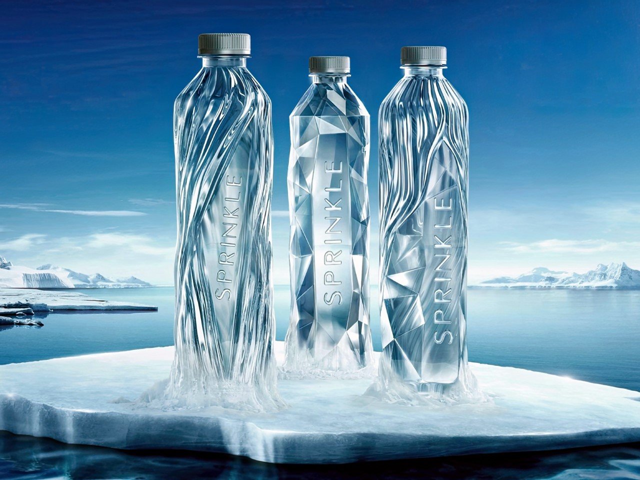
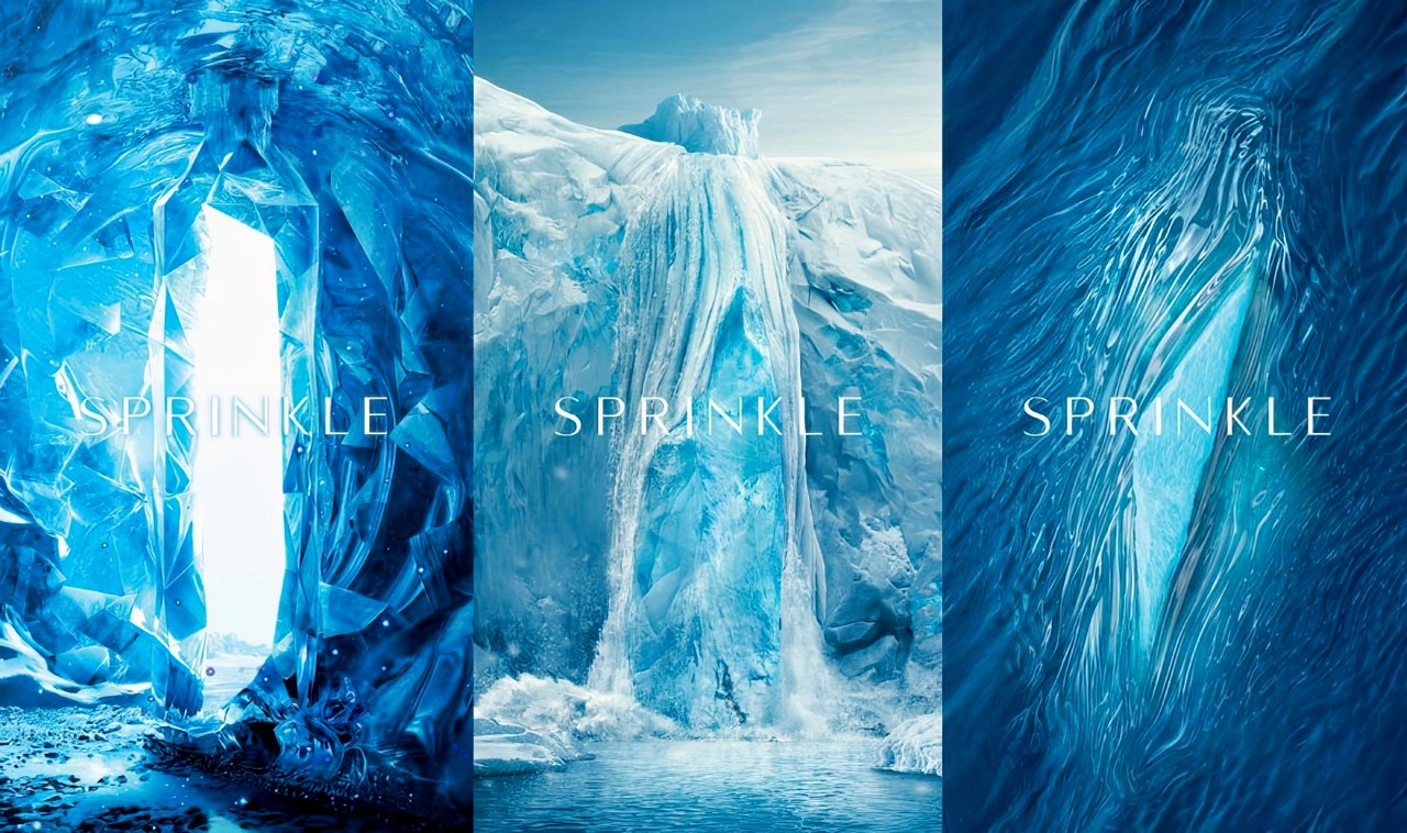
These Water Bottles Capture The Process Of Glaciers Melting Into Spring Water
These Water Bottles Capture The Process Of Glaciers Melting Into Spring WaterGlobal warming, but make it art. Usually, I never give a drinking water bottle a second glance. Water costs hardly anything, and it’s such a...
Global warming, but make it art.
Usually, I never give a drinking water bottle a second glance. Water costs hardly anything, and it’s such a utility/necessity that elevating it to a design icon level is something only luxury brands like Evian or Dasani attempt at doing. That basically means the remaining 90% of brands have the most boring water bottle designs on the planet, made to be used and thrown – but the Sprinkle bottle doesn’t look at packaging that way.
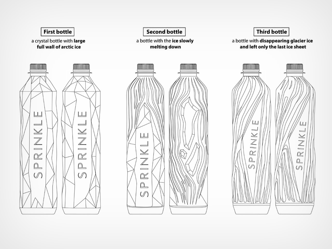
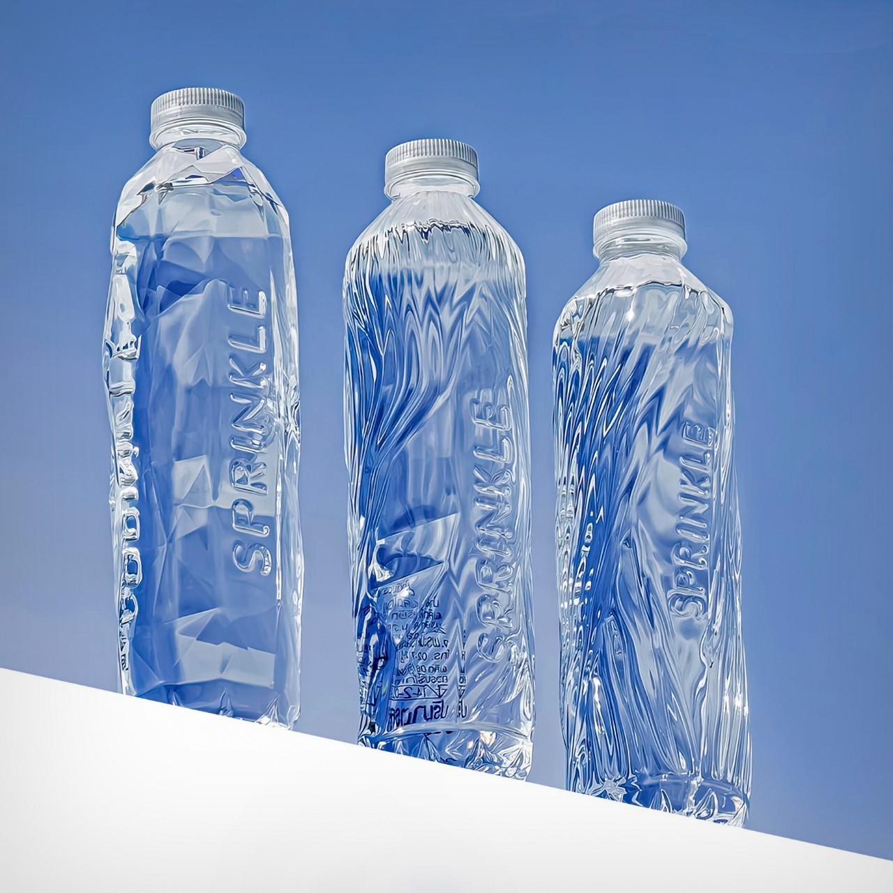
Designed to capture the journey of their water, Sprinkle’s bottles come in 3 design formats – one in glacial form, one in an intermediary stage, and one as glacial water that usually then gets bottled at source. The bottle comes sans label, allowing this beautiful distinction to stand out, while its overall motto remains to be a brand that doesn’t dwell in excess. The lack of a label reinforces Sprinkle’s overall “REDESIGN TO REDUCE” mindset.
Designer: Prompt Design for M.WATER COMPANY LTD.
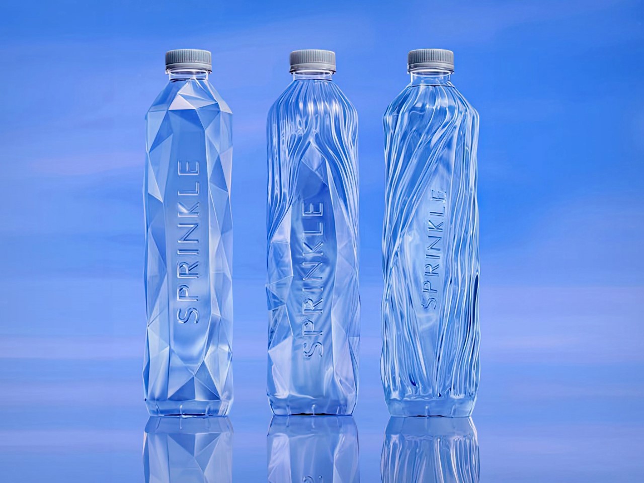
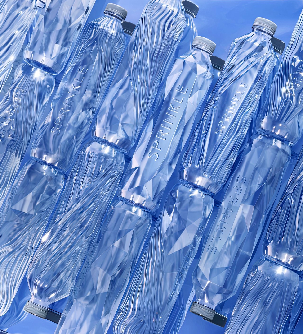
The Sprinkle bottle evokes a sense of purity, with its crystal-like design. It’s entirely clear, with the bottle looking almost like an ice sculpture itself. There’s no label, no graphic, not even an interplay of matte and gloss surfaces. It’s all monolithic and shimmery, which really allows the 3-part design to shine through.
The bottle displays the water’s journey from source to sip. It starts with a block of arctic ice, which slowly melts into glacial form, finally becoming the spring water we associate with freshness and purity. The journey of ice to water is also a cautionary tale of sorts, showing climate change through design. The bottle’s design journey shows the loss of ice caps, and sure, while we’re left with a lot of drinking water as a result, there’s still a sense of unstoppable change and of loss that’s difficult to shake.
The bottle was designed by the folks at Prompt Design, who had to work with a unique set of challenges. Apart from needing to create a bottle that was impactful and memorable enough to stand out on a grocery shelf or refrigerator, they also had to work around the label bit, finding unique places to list important information. To that end, the company devised a way to print the barcodes on top of the bottle cap, keeping the entire bottle itself looking incredibly pristine.
The post These Water Bottles Capture The Process Of Glaciers Melting Into Spring Water first appeared on Yanko Design.