Smashing Animations Part 2: How CSS Masking Can Add An Extra Dimension
What if you could take your CSS animations beyond simple fades and slides — adding an extra dimension and a bit of old-school animation magic? In this article, pioneering author and web designer [Andy Clarke](https://stuffandnonsense.co.uk) will show you how masking can unlock new creative possibilities for CSS animations, making them feel more fluid, layered, and cinematic.
May 14, 2025 - 15:40
0
Despite keyframes and scroll-driven events, CSS animations have remained relatively rudimentary. As I wrote in Part 1, they remind me of the 1960s Hanna-Barbera animated series I grew up watching on TV. Shows like Dastardly and Muttley in Their Flying Machines, Scooby-Doo, The Perils of Penelope Pitstop, Wacky Races, and, of course, Yogi Bear.
Mike loves ’90s animation — especially Disney’s Duck Tales). So, that is the aesthetic applied throughout the design.
I used animations throughout and have recently added an extra dimension to them using masking. So, to explain how this era of animation relates to masking in CSS, I’ve chosen an episode of The Yogi Bear Show, “Disguise and Gals,” first broadcast in May 1961. In this story, two bank robbers, disguised as little old ladies, hide their loot in a “pic-a-nic” basket in Yogi and Boo-Boo’s cave!
What could possibly go wrong?
What’s A Mask?
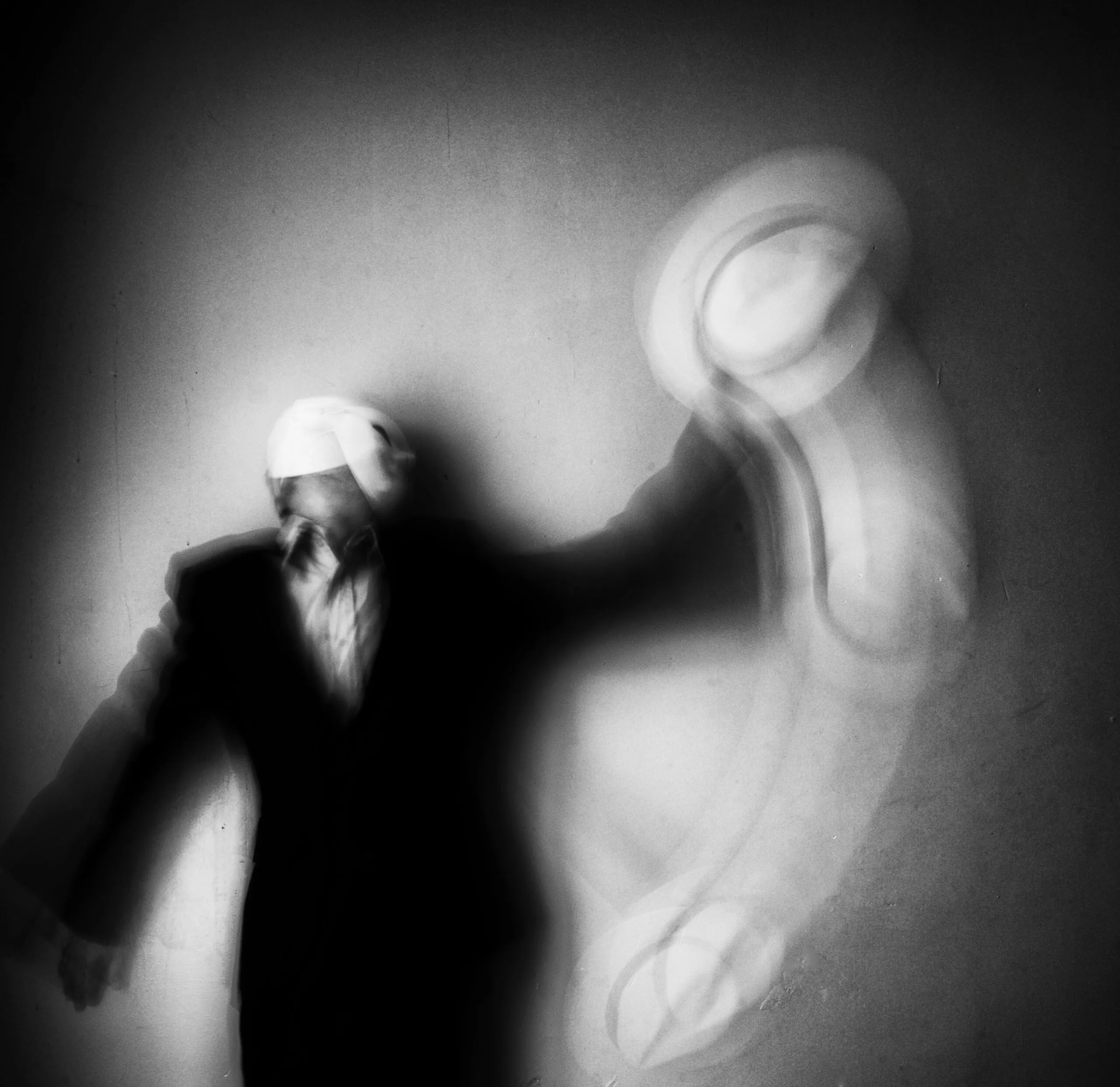
One simple masking example comes at the end of “Disguise and Gals” and countless other cartoons. Here, an animated vignette gradually hides more of Yogi’s face. The content behind the mask isn’t erased; it’s hidden.
In CSS, masking controls visibility using a bitmap, vector, or gradient mask image. When a mask’s filled pixels cover an element, its content will be visible. When they are transparent, it will be hidden, which makes sense. Filled pixels can be any colour, but I always make mine hot pink so that it’s clear to me which areas will be visible.
A clip-path functions similarly to a mask but uses paths to create hard-edged clipping areas. If you want to be picky, masks and clipping paths are technically different, but the goal for using them is usually the same. So, for this article, I’ll refer to them as two entrances to the same cave and call using either “masking.”
In this sequence from “Disguise and Gals,” one of the robbers rushes the picnic basket containing their loot into Yogi’s cave. Masking defines the visible area, creating the illusion that the robber is entering the cave.
How do I choose when to use clip path and when to choose mask?
I’ll explain my reasons in each example.
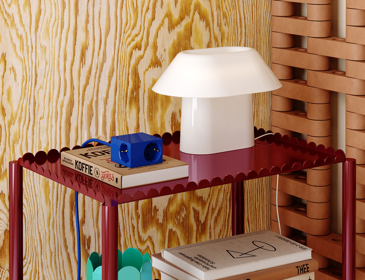
When Mike Worth and I discussed working together, we knew we would neither have the budget nor the time to create a short animated cartoon for his website. However, we were keen to explore how animations could bring to life what would’ve otherwise been static images.
Masking Using A Clipping Path
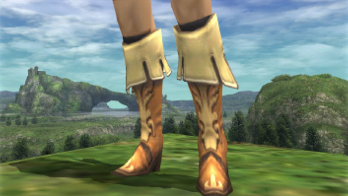
On Mike’s biography page, his character also enters a cave. The SVG illustration I created contains two groups, one for the background and the other for the orangutan in the foreground:
I defined a keyframe animation that moves the character from 2000px on the right to its natural position in the center of the frame by altering its translate value:
I wanted him to become visible at the edge of the illustration instead. As the edges of the cave walls are hard, I chose a clip-path.
There are several ways to define a clip-path in CSS. I could use a primitive shape like a rectangle, where each of the first four values specifies its corner positions. The round keyword and the value that follows define any rounded corners:
clip-path: rect(0px 150px 150px 0px round 5px);
Or xywh (x, y, width, height) values, which I find easier to read:
clip-path: xywh(0 0 150px 150px round 5px);
I could use a circle:
clip-path: circle(60px at center);
Or an ellipse:
clip-path: ellipse(50% 40% at 50% 50%);
I could use a polygon shape:
clip-path: polygon(...);
Or even the points from a path I created in a graphics app like Sketch:
clip-path: path("M ...");
Finally — and my choice for this example — I might use a mask that I defined using paths from an SVG file:
clip-path: url(#mask-cave);
To make the character visible from the edge of the illustration, I added a second SVG. To prevent a browser from displaying it, set both its dimensions to zero:
This contains a single SVG clipPath. By placing this inside the defs element, this path isn’t rendered, but it will be available to create my CSS clip-path:
I applied the clipPath URL to my illustration, and now Mike’s mascot only becomes visible when he enters the cave:
#cave {
  clip-path: url(#mask-cave);
}
Try this yourself:
While a clipPath will give me the result I’m looking for, the complexity and size of these paths can sometimes negatively affect performance. That’s when I choose a CSS mask as its properties have been baseline and highly usable since 2023.
The mask property is a shorthand and can include values for mask-clip, mask-mode, mask-origin, mask-position, mask-repeat, mask-size, and mask-type. I find it’s best to learn these properties individually to grasp the concept of masks more easily.
Masks control visibility using bitmap, vector, or gradient mask images. Again, when a mask’s filled pixels cover an element, its content will be visible. When they‘re transparent, the content will be hidden. And when parts of a mask are semi-transparent, some of the content will show through. I can use a bitmap format that includes an alpha channel, such as PNG or WebP:
mask-image: url(mask.webp);
I could apply a mask using a vector graphic:
mask-image: url(mask.svg);
Or generate an image using a conical, linear, or radial gradient:
mask shares the same syntax as CSS backgrounds, which makes remembering its properties much easier. To apply a background-image, add its URL value:
background-image: url("background.webp");
To apply a mask, swap the background-image property for mask-image:
mask-image: url("mask.webp");
The mask property also shares the same browser styles as CSS backgrounds, so by default, a mask will repeat horizontally and vertically unless I specify otherwise:
Mike’s FAQs page includes an animated illustration of his hero standing at a crossroads. My goal was to separate the shape from its content, allowing me to change the illustration throughout the hero’s journey. So, I created a scalable mask-image which defines the visible area and applied it to the figure element:
figure {
  mask-image: url(mask.svg);
}
To ensure the mask matched the illustration’s dimensions, I also set the mask-size to always cover its content:
figure {
  mask-size: cover;
}
Try this yourself:
figure {
  clip-path: ellipse(45% 35% at 50% 50%);
}
However, the hard edges of a clip clip-path don’t create the effect I was aiming to achieve:
Try this yourself:
Finally, to add an extra touch of realism, I added a keyframe animation — which changes the mask-size and creates the effect that the lamp light is flickering — and applied it to the figure:
To let someone know they might’ve reached the end of their adventure, I wanted to ape the zooming-in effect I started this article with:
I created a circular clip-path and set its default size to 75%. Then, I defined the animation keyframes to resize the circle from 75% to 15% before attaching it to my figure with a one-second duration and a three-second delay:
Masking adds an extra dimension to web animation and makes stories more engaging and someone’s experience more compelling — all while keeping animations efficiently lightweight. Whether you’re revealing content, guiding focus, or adding more depth to a design, masks offer endless creative possibilities. So why not experiment with them in your next project? You might uncover a whole new way to bring your animations to life.


![Odd Couplings [BODY OF EVIDENCE & DAMAGE]](http://2.bp.blogspot.com/_0uQUF0LK0NQ/Svr4k4n2lbI/AAAAAAAAAG8/sKnt2TuDgt4/s320/MADONNA++-++WILLEM+DaFOE.bmp)
![Don’t Look Back [short story]](https://jonathanrosenbaum.net/wp-content/uploads/2011/11/friedrich-mountain-landscape1-300x232.jpg)


 What’s A Mask?


 Masking Using A Clipping Path