


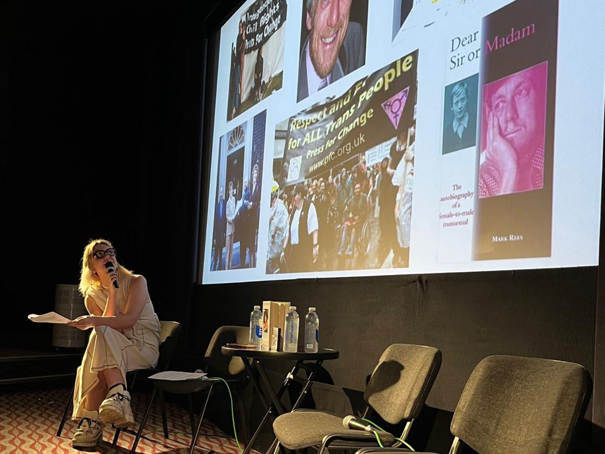
![White Paper Games Announces Psychological Thriller ‘I Am Ripper’ [Trailer]](https://bloody-disgusting.com/wp-content/uploads/2025/05/iamripper.jpg)


![Hollow Rendition [on SLEEPY HOLLOW]](https://jonathanrosenbaum.net/wp-content/uploads/2010/03/sleepy-hollow32.jpg)
![It All Adds Up [FOUR CORNERS]](https://jonathanrosenbaum.net/wp-content/uploads/2010/08/fourcorners.jpg)


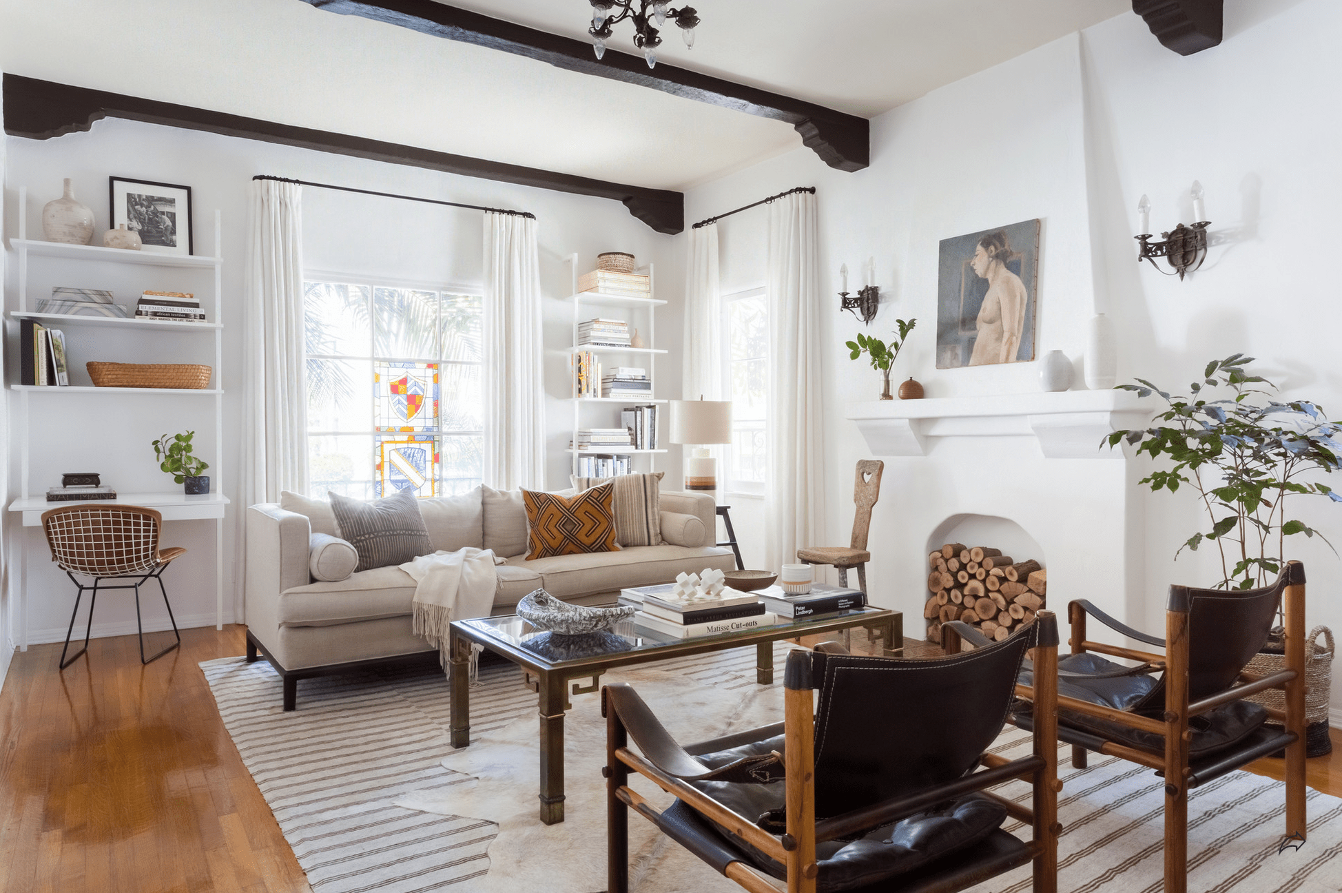


10 Very Good Design Ideas We’re Mentally Bookmarking From The Pasadena Showcase House (+ A Fun Fact You Probably Didn’t Know)
Raise your hand if you spent your weekends as an adolescent being towed around town from model home community to model home community by your parents? ::raises both hands:: I’d be lying if I said I didn’t like it. While ... The post 10 Very Good Design Ideas We’re Mentally Bookmarking From The Pasadena Showcase House (+ A Fun Fact You Probably Didn’t Know) appeared first on Emily Henderson.

Raise your hand if you spent your weekends as an adolescent being towed around town from model home community to model home community by your parents? ::raises both hands:: I’d be lying if I said I didn’t like it. While your family pastime might have been something like playing sports together, going on long bike rides, or having family movie nights, mine was hunting down the Parade of Homes, or at the very least, the newest Pulte or Lennar Homes development.
For my parents, I’d guess they were able to imagine a life of tidy kitchens and rooms built for conversation, even if just for 20 minutes; but for me, I was in awe of the *design*. This is where I learned that walls could be colors other than white, and curtains could match bedspreads. It was my Architectural Digest before I ever cracked open a magazine.
Well, design showhouses are like a bouquet of model homes all together under one roof, where each room is dreamed up by a proper interior designer. It’s a place where designers get to really dream; where they don’t have a client telling them to turn down the dial on the drama. It’s a true showcase of their vision and taste, and boy, is it fun to see as a spectator. Like living the dream of touring that open house for the fanciest house in the fanciest neighborhood of where you live. Looky-loos, unite!
This past weekend, Jess and I visited the Pasadena Showcase House for the Arts (which benefits many music programs and grants locally), and if you’re in the area, it’s definitely worth a visit—be sure to catch it before it ends on May 18. Our inner design voyeurs loved roaming through the expansive house; I remember the number 15,000 coming before “square feet” when a volunteer was scanning our tickets. We saw over 20 rooms by two dozen designers, but in the dizzying smorgasbord of ideas, there were definitely a few that stood out to me. Whether as reminders of tricks of the trade I often forget about, or totally new-to-me concepts I had to share.
Come along with me as I break down the best 10 ideas I’m saving in my mental bank (plus a bonus little detail that made both me and Jess go “how cute!”).
#1: Wood Paneling > Beadboard In A Kitchen?

Room: Carriage House Kitchen | Designer: A1000xBetter
We’ve been big fans of Kirsten Blazek from A1000xBetter, so we were thrilled to be able to chat with her at the Showhouse and see her project. She designed the entire carriage house, which was a standalone building outside of the main home. My eye was instantly drawn to the heavily grained wood paneling that she carried through the compact kitchen space. So often, I see white beadboard, stone or tile used in the space, and it was really refreshing to see another material for a change.
I always love studying a masterful designer’s work because I find they would do things I wouldn’t think of doing: in this case, matching that heavy grain with a showcase marble like the one here. Surely, they’d steal each other’s thunder, but nope, they just worked so well together. It was warm, interesting and a pleasant departure from the tired all-white kitchen.

Room: Carriage House Kitchen | Designer: A1000xBetter
Here’s another angle of the space, and you can see she took the material and brought it into the hutch and drawer fronts of the left side (almost like a built-in furniture piece), as well as behind the peninsula.
#2: Highlight A Truly Special Space With A Truly Special Trim

Room: Primary Suite Bathroom | Designer: Plaster & Patina
Plaster & Patina pulled off probably my favorite area of the whole house. You’ll see more of the primary suite in a bit (it was killer IRL), but let’s start with the bathroom. Sadly, I didn’t take any photos of the room, assuming there were more images available of it, but alas, this is the only one. Regardless, it does show off what I wanted to point out: Breaking from the mold (ha) of your molding to highlight something like this tub nook. Designer Alex Azat opted for this luxe honey onyx as a frame for the freestanding tub, which you brought into other moments of the high-end bathroom. You can’t see it here sadly, but that same onyx showed up on the shower bench, on the double vanity surface, and even in the lighting fixtures that graced the ceiling.
While most of us probably don’t have a home that would make much sense for something like backlit onyx, I could see a riff on this technique with paint, or even marble.
#3: Don’t Forget That You Can Use A Casual Natural Fiber Rug To Bring A Formal Rug Or Room Down To Earth

Room: Library | Designer: Julia Chasman Design
I have written a handful of articles in my time about this very trick that is especially helpful for vintage rugs that come in funky sizes or can be a touch too small, but it’s an easy one to overlook. Always remember that the simple act of laying down a larger natural fiber rug (think sisal or seagrass) under a more organte or vintage rug accomplishes two things: It gives you more rug to work with to better ground your furniture and rooms, and it also looses the tight grip that a formal floorcovering can have.
HOT TIP: Try to keep the overhang between six inches to no more than a foot, or else things might start looking a bit wonky. I zoomed in to the spot in the library photo so you can better see it:

Room: Library | Designer: Julia Chasman Design
Then I saw that technique again in the very fancy formal dining room:

Room: Formal Dining Room | Designer: The Art of Room Design
More rug also protects your hard flooring better, of course, without giving “wall-to-wall carpeting” vibes as long as you’re using a flat, neutral rug. No shags, okay??
Tip #4: No Budget For Tile? Do Wallpaper, Instead

Room: Bauer Lounge | Designer: Denise Bosley Interiors
The Bauer Lounge was the first room we walked through, and it’s clear they shot it before it was styled out or likely finished, as there were no images available for the rest of the space (which was so lovely). Anyhow, I really liked the use of wallpaper behind the bar shelves instead of a more expected tile. In a small area like this, it could be a very fun way to bring in a paper you really love that might be too costly to cover a room in. That, or if a showy tile isn’t in the budget, less than 10 square feet of wallpaper is a cost hack no one will think was some kind of savings plan.
Tip #5: Create Dimension And Texture In The Absence Of Color

Room: Bauer Lounge | Designer: Denise Bosley Interiors
Also in the lounge, I spotted a moment of quiet luxury. Again, you can’t see it well here (I’m sorry!), but inside, most of the picture frame molding was a slightly darker/richer cream in a grasscloth rather than paint. The result was textural, subtle, and serene. The ceiling added to this, being a deeper milk chocolate applied in a velvety plaster (a lime wash would also suffice). These shifts in color and shade worked so well in person to feel like there was tons of interest without the visual assault some people feel when layers or brighter colors.
Tip #6: Pull Your Bed WAY Off Your Window For A Grand Primary Suite

Room: Primary Suite | Designer: Plaster & Patina
You’ll have to trust me that this was one of those rooms you walked into and you felt this buzz of excitement because it felt so *right*. The first thing I did was gasp in Jess’ direction about the placement of the bed. It was pulled away from the bank of windows (that I later realized were French doors) about three feet. Welcome to another moment of “I’d never think to do this.” Float a sofa? Sure. Float a bed? Harder to pull off. The key, according to the designer who chatted with us for a moment about it, was a headboard that was grand enough, like this one. “And storage layers,” I added. The open shelving on their own plane behind the plane of the bed and nightstands made it all make sense when you were standing in the room. Here’s a snapshot I captured on my phone from a different angle:

Room: Primary Suite | Designer: Plaster & Patina
There was enough space to walk between, though it looks tight in my image. You could easily access the French doors to open behind the bed if you needed. No, most of us will not have this scenario in our non-manor homes, but it could be cool to do something similar in a large room and earmark the space behind the bed (in front of a window) for a desk, for instance. Or a pretty bench for a little secluded reading spot. I mean…there are so many options once you pull a bed off the wall that I didn’t know existed!
Tip #7: Got A Corner To Fill? Skip The Usual Armchair For A Round Table, Instead

Room: Primary Suite | Designer: Plaster & Patina
Behind the pass-through shelving in the primary suite was this area that included what we’re seeing above on the right side, and a vanity table on the left. The round table was styled with a smattering of books, though in theory it could be used as a desk, as a spot for a collection of family photos, or even just to hold a giant, leafy plant. I think it would have been easy to put a gorgeous lounge chair or traditional desk here in this corner, but the round entryway table adds an unexpected moment that I really enjoyed.
Tip #8: Molding + Wallpaper = Subtle Ceiling Drama

Room: Ladies’ Powder Room | Designer: Jennifer Bevan Interiors
One thing a showhouse is going to give you is some bold ceilings. It never fails (and I’ve seen many). Look, I love the idea of a wallpapered ceiling, but if I’m being honest, it can often feel suffocating to me unless it’s a paper-drenching thing happening. Here, I love how Jennifer Bevan brought the wallpaper past the molding about 12 inches or so, and capped it off with a simple base cap molding. It really makes a statement without being overwhelming.
Tip #9: A Thin Line Of Paint And Molding Ups The Ante On Your Ceiling

Room: Guest Suite | Designer: Billman Designs
Similarly, you can use paint to create some interest on the ceiling, like in the Guest Suite by Billman Designs. Here, she added a three or four-inch border with a base cap molding, too, and it really draws the eye up. It could be cool to incorporate a color-blocking technique with something like this for something more maximalist if that’s your flavor. Imagine the walls and ceiling in one shade of a color—say blue—the baseboard and crown in a darker shade of blue, and the inset border in something in between. It would add so much dimension!

Room: Guest Suite | Designer: Billman Designs
Just giving you a little closer look.  Read More


