

![Body Horror Sim ‘Zoochosis’ Announced for PlayStation Consoles [Trailer]](https://bloody-disgusting.com/wp-content/uploads/2025/05/zoochosis.jpg)
![Latest ‘Elden Ring Nightreign’ Trailer Highlights the Game’s Systems [Watch]](https://bloody-disgusting.com/wp-content/uploads/2025/05/nightreign.jpg)


![100K strategy and powering up with the right cards [Week in Review]](https://frequentmiler.com/wp-content/uploads/2025/05/powering-up-credit-cards-1.jpg?#)


![2025 Best Credit Card Bonus Offers [May]](https://viewfromthewing.com/wp-content/uploads/2015/03/credit-cards.jpg?#)


Revisiting A 2013 Project, DesignLoveFest’s Apartment (+ What I Think About It Now)
In our grown-up pursuit of “timelessness” (which gets more intense as we get older), it sure is fun to see a time capsule of our youth. The year was clearly 2013, and two “internet famous” bloggers collabbed on what now ... The post Revisiting A 2013 Project, DesignLoveFest’s Apartment (+ What I Think About It Now) appeared first on Emily Henderson.

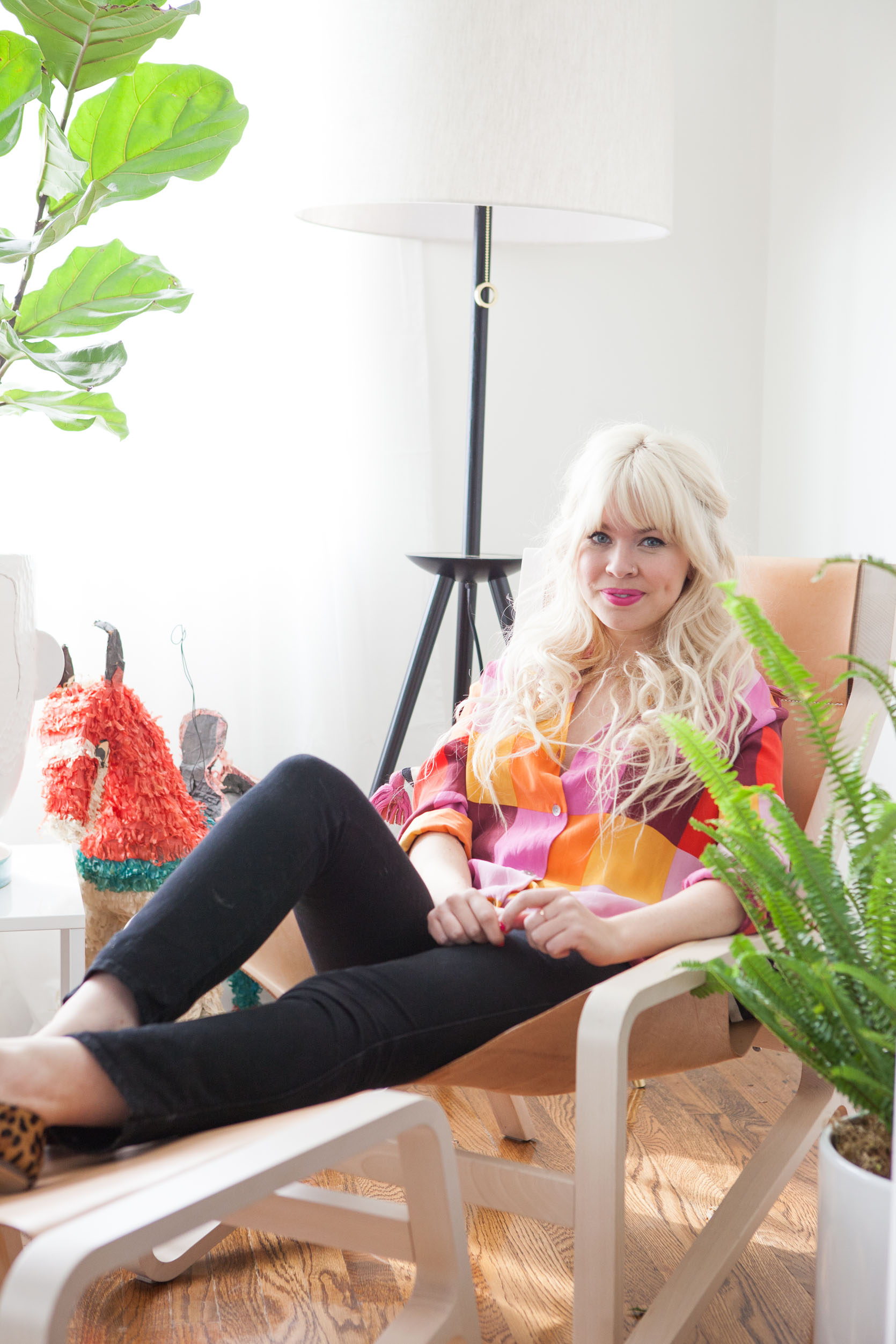
In our grown-up pursuit of “timelessness” (which gets more intense as we get older), it sure is fun to see a time capsule of our youth. The year was clearly 2013, and two “internet famous” bloggers collabbed on what now feels like OG vintage influencer content. When I stumbled on Bri Emery’s apartment from 2013, I gasped and then wanted to gossip about it with you. So much to talk about. It still pops so hard and is full of pieces that I love, while also just screaming “2010’s blogger time capsule”. It’s a real lesson in where to bring in trends as well as demonstrating the power of vintage and color. This was my last “blogger collab,” where I designed/styled famous blogger’s homes (who would be called influencers now) to cross promote, garner press, more followers, etc (I decorated Cup of Jo’s apartment, Oh Joy’s (multiple times), Nicolette Mason and then Bri Emery, aka DesignLoveFest, Green Wedding Shoes nursery, and many more). Bri redesigned our website (which has since been redesigned and is DESPERATE for a new redesign – coming soon, I hope), and I designed/styled her living and dining room. If you want to read the original post, check it out -it’s a funny read.

That’s Bri, aka DesignLoveFest, and if you haven’t seen her new kitchen in upstate New York, you MUST. She, like most OG design/style bloggers, made a lot of life shifts, and after taking a long creative/personal sabbatical from social media, she is posting again and collaborating with other old friends (which is so fun to watch on stories). She has always been wildly creative and such a visionary, so I’ll follow her forever. I dream of doing a “Bloggers: Where Are They Now” series because most of the OG crew that really took off in the 2010s, have changed careers and are thriving in such different and interesting ways (I think like 10 of us are still here, spoiler – social media caused burn out really fast). That’s a whole other story, but today let’s look at Bri’s 2013 apartment transformation:

I swear we didn’t try to take low-light befores back then… But here’s the super bright after! LOL

My first gut reaction: this room is undeniably still so fun. If I walked into this apartment now, I would think this person has so much style and creativity, an eclectic, even eccentric, point of view, and we are about to have fun. And then, of course, I’d want to edit it a bit, tweak it for 2025. So let’s talk through the main trends that were big then:
2013 Trend #1: Bright White With Pops Of Bright Colors
I was so guilty of this, doing it over and over in that decade (and still am!). The formula: all white walls, big pops of color, drenched in natural light. And the thing is, this still really works in Southern California. Of course, now we’d do a warmer neutral, and employ darker, more subtle greens and lots of muted pinks. Heck, my brother and SIL wanted a version of that in their bedroom (see here). I think for the most part it works, it’s just some of the colors here that make it feel a bit 2013. I would definitely get rid of that scalloped pillow on the sofa and reduce the amount of hot pink (the vintage ottoman could be more of a neutral).
2013 Trend #2: Fig Trees And Whimsical Plants Galore (In Whimsical Pots!)
Again, I still like fig trees, but my goodness, they were EVERYWHERE in the 2010s (mostly because of me, I think – remember DesignStar?), so I really don’t think we needed two here. And while having plants galore is more popular than ever, I don’t think doing it like this is working. I think it’s just a bit messy, the pots are a bit eclectic, and it feels generally over the top. If I could do it again, I’d do one big fig tree and a smaller green plant on the coffee table. Also, not sure we need a decorative piñata…
2013 Trend #3 Palm Springs Style Mid-Century Vintage Everything In Bright Colors
Again, I don’t mind this trend!! Mid-century is never out, and I don’t think that there is too much of it here. It’s just combined with the big saturated colors and the Moroccan rug and brass that make all the pieces feel 2013. But yes, in the 2010s, before any of us had a budget to buy investment pieces from adult stores, we bought anything from the Rose Bowl flea market, which was full of midcentury vintage from Palm Springs. None of these are dated; it’s just within the context of so much stuff and bright colors that it screams 2013.

What’s Not Working?? What Would I Get Rid Of?
That’s pretty easy – the black chair with the more Navajo-inspired woven pattern feels like we were trying hard to dip into that next trend (I’m not sure what to call it, I apologize if I’m not accurate here). At the time were really seeing the rise of African mudcloth and Aztec-style prints, and now we know better and to never buy them in a mass-produced fashion. Purchasing from the actual people whose culture these textiles belong to should always be a priority, like with my Boro fabrics. I do like the idea of the pattern, but it belongs somewhere with less bright, saturated colors or trendy pieces. I’d also nix the gold drum table (very 2013), and I’d reduce the amount of stuff by 1/3rd AT LEAST. And I really, really don’t like that colorful pillow on the sofa.


I think this was during my “miniatures” phase that I’ve never really grown out of, TBH, but I don’t force it on my friends as much now. Those flowers are WAY too big and busy in here, IMHO.

I still love those vintage lamps and would use them in the right project now. The art was from the flea market, and the Blu Dot table is so simple that it’s hard to call it in or out, but the collective vignette just feels very 2013 due to the color palette. Now I’d change the drum shades to be more tapered or pleated (or a color).


Nothing really dated here except all my EHD vintage whimsy, which I still love, but it’s a younger version of me. That lamp is still pretty darn cute.

The midcentury shelving unit is rad still, just needs to be styled with less stuff and with more grounding colors (i.e. less teal and yellow). So many plants shoved in this shot!!!

I really think the culprit here is mostly just the accessories and the styling, both of which were obviously 100% on me. And in a lot of ways, that is refreshing because those are the things that are less of an investment and easier to change.


I still really like this!!! It’s just a bit too much, too many small trends that inevitably read as 2013, and too much “stuff”. But those are almost all in the smaller pieces and would be so easy to tweak to make them work.


It’s visually so fun and stimulating,g so while it seems like I’m tearing my own work apart, it’s actually really easy to see that with a few tweaks it could feel 2025 really easily.

We kept with the same styles and colors in the dining room – that vintage dining set is still so rad, and Mid-century teak is having a big comeback right now, so do NOT sell your stuff, people.

Besides me holding the plant hostage in that cage, I think most of this works, but maybe just too much altogether.


The Brendan Ravennhill light fixture had just launched, and Max Wanger’s photography was so popular (they both pioneered a LOT of copycats).
While I wouldn’t go back to 2013 Emily, I think this room actually has a lot of timelessness.
The Lessons In Trends And Timelessness:
- You will not be able to avoid leaning into some trendy design elements if you are super into design (no one is immune to the zeitgeist), but if you want to avoid looking dated, buy the high quality version of it or just do it in accessories that aren’t as much of an investment to change out. I think the squiggle or amorphous shapes are great current examples – bring them in in limited amounts to avoid looking dated real fast.
- Bright colors will always be more likely to be “dated”, but that doesn’t mean we should avoid what we love right now. Will they call 2022 the year of dark moody green everything? Yep! But I don’t know how you avoid any color trends without just being so boring. Will warm pinks, browns, and burgundies also be less exciting in 10 years? Probably, but again, there is no such thing as timeless colors, and for the most part, there is a way to make them still work with styling. A well-designed room with high-quality materials done in a balanced way will likely still be very pretty in 20 years. Sure, there are some navy blue tones that feel fresher than others, but for the most part, blues, greens, and neutrals are timeless (coming from someone who has and will always love blues and greens, so I’m very biased). Although if you live in Texas or Arizona it’s likely warmer tones that feel timeless there. It’s so nuanced, folks. Good luck! LOL.
- Too much stuff can really overwhelm a room (and in this case, make it feel dated). I think this can be blamed on youth, especially when we are younger and we can’t afford the more expensive design elements, but we love to shop, we are drawn to smaller things that we love, because it’s what we can buy. Nothing wrong with this, but just know that displaying it all, on every surface, especially when they are all super eclectic, can just look a bit cuckoo. I had to learn this lesson over and over and over.
- Authentic Vintage will always be in style – it’s just context, styling, and color combinations that can make the pieces look dated to the specific era that it “came back” in.
For the most part, I think that this room could be tweaked so fast to make it feel “in” right now – the main “dated” culprits are in the accessorizing, which feels pretty harmless to me. Thoughts????
**Design by Emily Henderson (me!)
*Photos by Laure Joliet
The post Revisiting A 2013 Project, DesignLoveFest’s Apartment (+ What I Think About It Now) appeared first on Emily Henderson.


