


![She Missed Her Alaska Airlines Crush—Then A Commenter Shared A Genius Trick To Find Him [Roundup]](https://viewfromthewing.com/wp-content/uploads/2024/07/alaska-airlines-in-san-diego.jpg?#)


.png?width=1920&height=1920&fit=bounds&quality=80&format=jpg&auto=webp#)
.png?width=1920&height=1920&fit=bounds&quality=80&format=jpg&auto=webp#)


![[Podcast] Should Brands Get Political? The Risks & Rewards of Taking a Stand with Jeroen Reuven Bours](https://justcreative.com/wp-content/uploads/2025/03/jeroen-reuven-youtube-1.png)
![[Podcast] Should Brands Get Political? The Risks & Rewards of Taking a Stand with Jeroen Reuven](https://justcreative.com/wp-content/uploads/2025/03/jeroen-reuven-youtube.png)


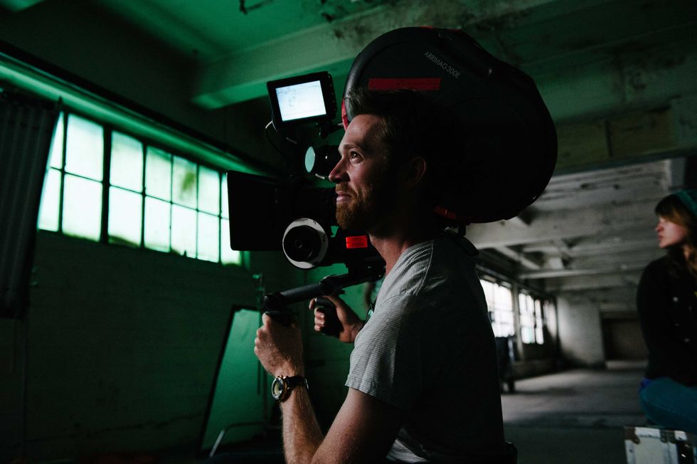
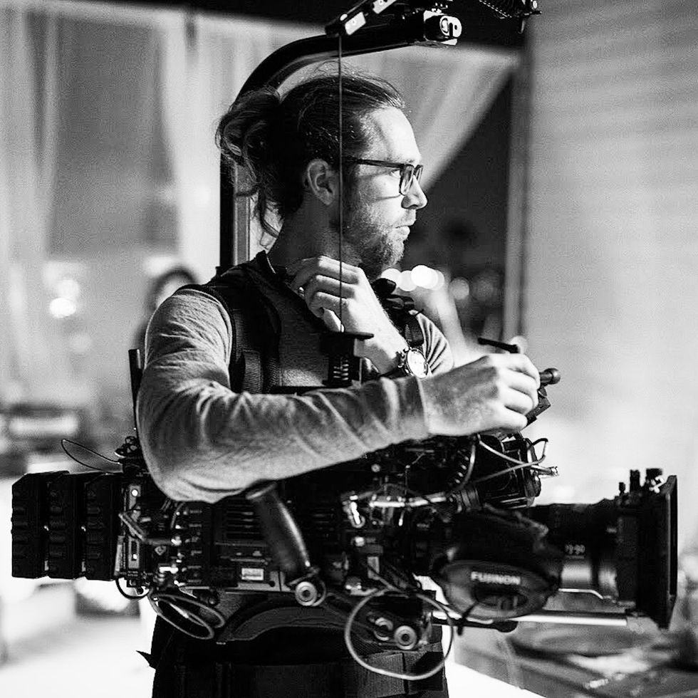
How to Light A Serial Killer With Cinematographer Gareth Paul Cox
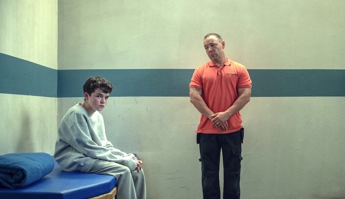
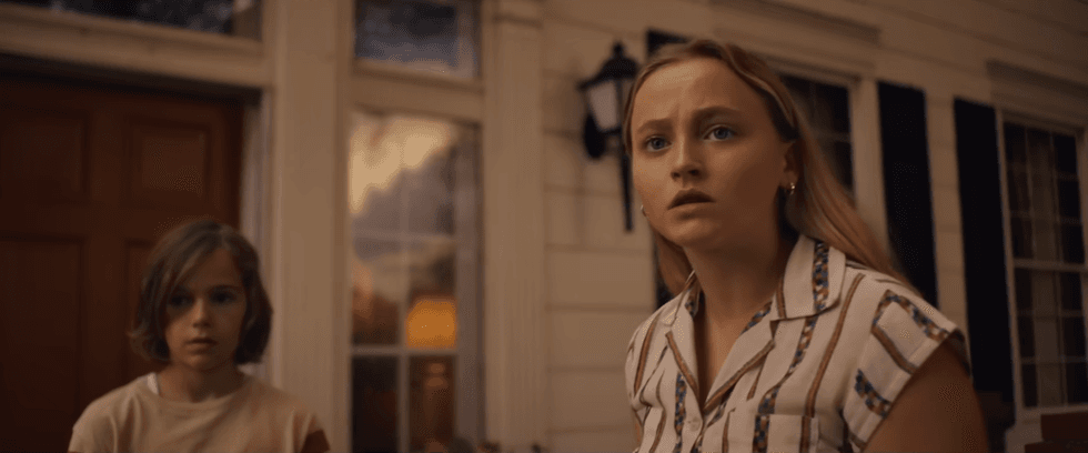
I don't know about you, but I love a creepy thriller with some deep filmic inspiration. That's why I really dug the look and feel of 'The Man in the White Van', which was shot by cinematographer Gareth Paul Cox. Cox crafted the film’s visual tone to blend a nostalgic 1970s aesthetic with a modern edge. The film begins with a warm, almost idyllic portrayal of suburban life, but as the tension rises, the visuals shift into darker, more monochromatic hues, with large, ominous night scenes representing the growing danger. I was excited to sit down with Cox to talk about this and all the other factors that went into lighting a serial killer in this movie. Let's dive in. NO FILM SCHOOL: The film’s visual tone transitions dramatically from the warmth of suburban life to a more ominous, monochromatic palette. How did you approach these changes in lighting and camera work to evoke these shifts emotionally? GPC: The progression of the color palette and tonality within the film was very important to tell Annie’s story. I’m a huge fan of the 1970s for many reasons, but most of all is the use of color and patterns. So when Director Warren Skeels and I spoke about Annie’s progression through the story, we wanted there to be a deliberate shift when the serial killer gets closer and closer to her. Warren had expressed he wanted the film to feel both timeless but also grounded in the nostalgia of the 1970s. When I think of films from the 70s, I always think of a textured warmth and often with smooth skin tones; this most likely comes from my research using editorial images but also films that were shot on celluloid. I found that a key element to helping the world feel nostalgic was to use a polarizer almost the entire time to control specular highlights (specifically more polarization for the happy times in Annie’s life) and tonality/gradation on the characters’ faces. As the film progresses, I use less and less polarization to help feel a shift in contrast and perceived latitude of the image. Of course, the other major element was to feel like Annie’s life might be taken at any moment. For this, we discussed leaning into cooler tones and much higher contrast ratios, so a lot of the darker and night scenes were shot using a more ominous cyan moonlight with plus green and very little fill. It really became a warm vs. cool look, and anytime the van or killer is close, the coolness creeps in. NFS: How did you use the van’s presence within the frame to build suspense and create a sense of menace without revealing too much? GPC: Photographing the van in a meaningful way actually proved to be more difficult than I initially thought it would be. The van showed up only a few days before filming, and even after seeing photos of the interior and exterior, we quickly realized we had our work cut out for us. The 1970s Ford Econoline work vans were much smaller than today's work vans. As a result, we had to get creative with lensing to make it feel more intense, intimidating, and ominous. 'The Man in the White Van'CREDIT: Relativity Media I also worked closely with the Production Designer Lauren Spalding and Art Director Kurt Knight to subtly modify the van. I asked that we tint the windows. Knowing that car window tinting existed but wasn’t as commonplace as it is today, I asked that we tint the windows, including the entire front windshield and back windows. We looked at a few densities of tint because I also knew we had interior night scenes in the van, and our lighting approach for these scenes was to use practical street lamps as we drove around. Ultimately, we arrived at a tint that allowed for the van to have serious darkness and appeal when looking at it from the exterior but not too heavy that we couldn’t see out of it at night. We definitely knew, per Director Warren Skeels, that we never wanted to reveal the serial killer's face. So this really helped in that regard as I then needed way less negative fill when looking through the windshield. The van needed to feel more graphic rather than appearing in extreme detail, so you’ll notice the windshield in the film always feels very sinister because we struggle to see into the van and ultimately see the serial killer. This also helps the viewer place their ideas of what's inside and what happens in the van rather than us showing them. We also implemented some low and wide-angle compositions to make the van feel much taller and larger than it actually is. This is particularly noticeable when the van comes to life at night, and we use the headlights to envelop Annie and the other victims. NFS: Which scene posed the greatest challenge to shoot, and what creative or technical solutions did you and your team employ to overcome it? GPC: I found myself challenged a lot in this film just due to the ground we needed to cover for a lot of the night scenes. The story calls for a few chase sequences in which Annie is injured and on foot, running in an orange grove and


I don't know about you, but I love a creepy thriller with some deep filmic inspiration. That's why I really dug the look and feel of 'The Man in the White Van', which was shot by cinematographer Gareth Paul Cox.
Cox crafted the film’s visual tone to blend a nostalgic 1970s aesthetic with a modern edge. The film begins with a warm, almost idyllic portrayal of suburban life, but as the tension rises, the visuals shift into darker, more monochromatic hues, with large, ominous night scenes representing the growing danger.
I was excited to sit down with Cox to talk about this and all the other factors that went into lighting a serial killer in this movie.
Let's dive in.
NO FILM SCHOOL: The film’s visual tone transitions dramatically from the warmth of suburban life to a more ominous, monochromatic palette. How did you approach these changes in lighting and camera work to evoke these shifts emotionally?
GPC: The progression of the color palette and tonality within the film was very important to tell Annie’s story. I’m a huge fan of the 1970s for many reasons, but most of all is the use of color and patterns. So when Director Warren Skeels and I spoke about Annie’s progression through the story, we wanted there to be a deliberate shift when the serial killer gets closer and closer to her.
Warren had expressed he wanted the film to feel both timeless but also grounded in the nostalgia of the 1970s. When I think of films from the 70s, I always think of a textured warmth and often with smooth skin tones; this most likely comes from my research using editorial images but also films that were shot on celluloid. I found that a key element to helping the world feel nostalgic was to use a polarizer almost the entire time to control specular highlights (specifically more polarization for the happy times in Annie’s life) and tonality/gradation on the characters’ faces.
As the film progresses, I use less and less polarization to help feel a shift in contrast and perceived latitude of the image. Of course, the other major element was to feel like Annie’s life might be taken at any moment. For this, we discussed leaning into cooler tones and much higher contrast ratios, so a lot of the darker and night scenes were shot using a more ominous cyan moonlight with plus green and very little fill. It really became a warm vs. cool look, and anytime the van or killer is close, the coolness creeps in.
NFS: How did you use the van’s presence within the frame to build suspense and create a sense of menace without revealing too much?
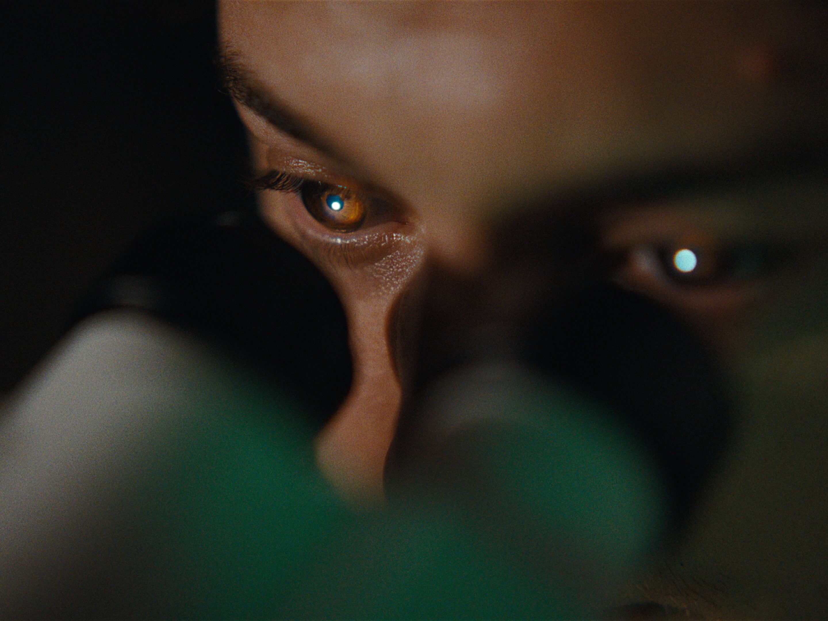
GPC: Photographing the van in a meaningful way actually proved to be more difficult than I initially thought it would be. The van showed up only a few days before filming, and even after seeing photos of the interior and exterior, we quickly realized we had our work cut out for us. The 1970s Ford Econoline work vans were much smaller than today's work vans. As a result, we had to get creative with lensing to make it feel more intense, intimidating, and ominous.
 'The Man in the White Van'CREDIT: Relativity Media
I also worked closely with the Production Designer Lauren Spalding and Art Director Kurt Knight to subtly modify the van. I asked that we tint the windows. Knowing that car window tinting existed but wasn’t as commonplace as it is today, I asked that we tint the windows, including the entire front windshield and back windows. We looked at a few densities of tint because I also knew we had interior night scenes in the van, and our lighting approach for these scenes was to use practical street lamps as we drove around. Ultimately, we arrived at a tint that allowed for the van to have serious darkness and appeal when looking at it from the exterior but not too heavy that we couldn’t see out of it at night.
We definitely knew, per Director Warren Skeels, that we never wanted to reveal the serial killer's face. So this really helped in that regard as I then needed way less negative fill when looking through the windshield. The van needed to feel more graphic rather than appearing in extreme detail, so you’ll notice the windshield in the film always feels very sinister because we struggle to see into the van and ultimately see the serial killer. This also helps the viewer place their ideas of what's inside and what happens in the van rather than us showing them. We also implemented some low and wide-angle compositions to make the van feel much taller and larger than it actually is. This is particularly noticeable when the van comes to life at night, and we use the headlights to envelop Annie and the other victims.
NFS: Which scene posed the greatest challenge to shoot, and what creative or technical solutions did you and your team employ to overcome it?
GPC: I found myself challenged a lot in this film just due to the ground we needed to cover for a lot of the night scenes. The story calls for a few chase sequences in which Annie is injured and on foot, running in an orange grove and in front of her house from the van. In both sequences, I had about half to three-quarters of a football field to light at once. The Van can cover a lot of ground quickly, even when it's just creeping along, so we found ourselves cheating the space a lot to double as traveling further. I also had the advantage of using the Panasonic Varicam’s in the higher of its dual native base ISO’s (5000iso). Ultimately this allowed our Skypanel 360 on a large boom lift (condor) to get us to a decent exposure.
 'The Man in the White Van'CREDIT: Relativity Media
We were most of the time out in a rural part of Shreveport, so there was little to no stray ambient light or light pollution except for radio and cell towers miles away with flashing lights. The other scene that comes to mind from a camera perspective is a process trailer shot in which the camera wraps around the car and reveals that the Man In The White Van now had a new target, Annie, as she unknowingly daydreams out the window with it lurking behind them.
We used a technocrane on the camera truck pulling the trailer and picture car. We only had a few takes to get it right, and a storm had just rolled through, delaying us even more, so we had about a 2-mile run to the turnaround and back to get the shot before moving on to a different location. About half a mile had trees on both sides of the road and really limited light, so I think we got four or five takes in, and that was it. The entire ‘oner’ made the film and is probably one of my favorite reveals of the van and its relationship to Annie.
NFS: What visual references or techniques did you draw from the 1970s, and how did you modernize them for today’s audience?
GPC: Stylistically, in terms of building suspense a big reference was Jaws for the sheer fact that you really don’t see much of the shark until the end of the film. We didn’t limit ourselves to only references from the 1970s, though, as we looked for all types of thrillers and utilized jump scares like in the Conjuring franchise. I think one place we modernized some of the past techniques is by incorporating slow zooms to underscore moments of unsettling tension. The film has a 2.39:1 aspect ratio but was actually shot spherically on Cooke S4’s and an Angenieux Optimo 30-76 zoom and then the 2.39 extracted from the 4K image. I think the spherical glass actually gave the film a more modern appeal, as we didn’t lean into heavy aberrations or barrel distortion. You don’t get lost in feeling the medium much as a result, and it lets the production design, wardrobe, and makeup shine a bit more.
NFS: What was your collaboration process with director Warren Skeels, and how did you collaborate to shape the film’s visual style?
GPC: Director Warren Skeels and I have worked together for well over a decade on many projects. We started our first collaboration in documentaries on his feature called Thespians about high school theater groups going to state competitions. We’ve spent well over four years together as both a DP/director duo and a DP/co-director duo on a reality show he created for MTV…so you could say we know each other's sensibility and styles quite well and know how to move quickly to execute something. We still have our moments, but there is a tremendous amount of trust between us, and for that, I’m forever grateful. We tend to have many evolving but mostly short conversations about what we’d like to see in the film and how we see it.
 Gareth Paul CoxCREDIT: Elizabeth Kitchens
Warren very much talks about intention as we discuss each scene and what it’s about. We found a world in which Annie’s family's home would always represent some sense of safety and warmth…until the killer enters, and then her world shifts. Even the home becomes a much different space. We designed camera movement to evolve from static frames and progress into smooth movements and then faster movements to lean into a rising tension.
Ultimately, my schedule at the time was very busy coming into the film, and we ended up with very little on-the-ground time together, so we somewhat defaulted to morning meetings and walkthroughs based on our conversations over the months leading up to the film as our schedule shifted and scenes moved around. I also tended to light scenes where very little augmentation was required, and since it was a single-camera movie, it allowed us to jump around quickly to get as many angles as we could as quickly as we could.
NFS: How did you work with the production design and location teams to ensure that the environments helped build the growing sense of unease throughout the story?
GPC: Lauren Spalding and her team had their work cut out for them, creating an entire world for us. She and I discussed everything from paint colors and wallpaper to practical fixtures and lampshades. She wanted to make the environment look natural and lived in, but I asked that we favor some darker and/or more muted colors in some of the spaces so I could light a bit higher key and not have to always control spill light. That said, we did tend to let some spaces be brighter so we could easily silhouette and switch the feeling of the room by adjusting how we lit it but still feel natural. For example, Annie’s sister's room, Margaret, is a very bright space, but as things close in on Annie, even her sister's room lets characters fade away into it. I would light the environment and give very little light to the characters for these scenes, so they felt a bit lost in the space, almost like Annie was struggling to see them.
Additionally, we also painted the van a specific off-white ivory and not pure white so we could photograph it in direct sun without it feeling too bright or overwhelming. Lauren and Art Director Kurt Knight then treated and aged the van so well that you would never know it was just freshly painted.
For locations, I mostly asked that we look for spaces with little interference from modern lighting or architectural lighting. Spaces that would allow for layering and contrast. It helped when they would find use spaces with some practical lighting that fit the time period. I was always looking for sodium vapor street lamps and we lucked out with a few locations in and around Shreveport that still had entire streets of them. This allowed us to quickly match them using our LEDs and start to create different lighting ratios. The other big ask from locations was clearing us to turn off or block most of the lights to help build spaces with only puddles of light. This helped get the van into the shadows and not directly illuminated on some of the streets. Then, you only see its silhouette until its headlights come to life.
 Gareth Paul CoxCREDIT: Nick Shirghio
NFS: Were there any specific camera techniques or angles you used to intensify the suspense, particularly in moments where danger is lurking just beneath the surface?
GPC: Warren and I wanted Annie’s world to close in around her, ultimately suffocating her and no longer allowing the audience to feel safe in the space. The audience can no longer see most elements around her so we could very quickly introduce things into her environment. The feeling of claustrophobia becomes much more visceral as the film progresses. We referred to it as a “boxed frame” that no longer utilized traditional “rules” in a 2.39 aspect ratio.
NFS: Given that the film is based on true events, how did you balance the need for dramatic tension with the responsibility of representing real-life fear and trauma in a respectful yet cinematic way?
GPC: Warren never wanted the film to glorify or exploit any of the victims or their families. We wanted to show enough to get the implied violence, but really, our intention was to build tension using different types of scares. Warren really wanted to lean into moments of getting to know the victims more than just an abduction. This is where the film's pacing as a slow burn throwback '70s thriller comes into play. Each victim leads us closer and closer to Annie and the main narrative; something serious is stalking her, and no one believes her.
From a camera perspective, this is where I was able to implement a bit more style to the photography, to make each victim scene less and less about seeing everything but rather continuing to build up the van as a driving character, pun intended. Making it more and more present in each victim's scene. It starts subtly at first, and by the end, we get access to some of the interior elements of the van and almost a glimpse of the killer. By making the killer's face obscured throughout the movie, I think it makes it less about who he is and more about the emotion of what he’s doing, which is absolutely horrifying. Giving all of us a sense that this was a tragic and unforgettable series of abductions.


