


IH Locha
IH Locha was born from a quiet but radical question: what if the letters we... Der Beitrag IH Locha erschien zuerst auf slanted.
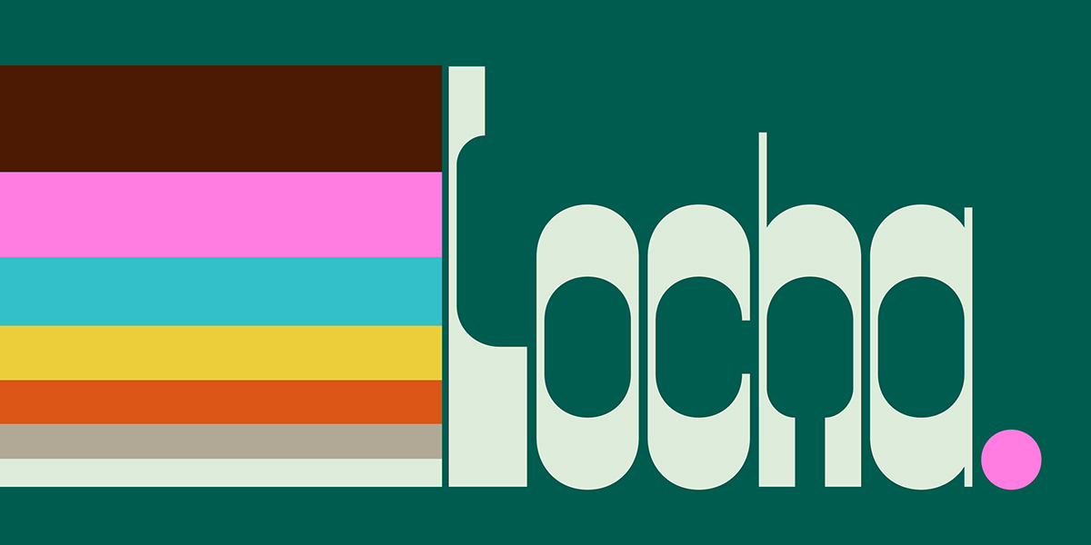
IH Locha was born from a quiet but radical question: what if the letters we use every day didn’t push us to move faster, consume quicker, or optimize every second? Created in collaboration with Alexander Wright and Michu Benaim Steiner at In-House Int’l and developed by Rodrigo Fuenzalida at FragType, Locha offers a different rhythm—one of intention, connection, and calm.
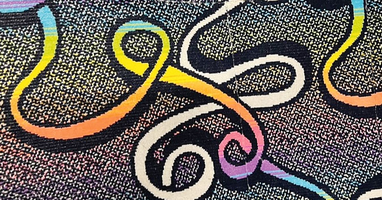
Locha invites us to slow down. Its softly geometric forms and rounded counters draw from the warm, welcoming aesthetic of 1970s signage and storefronts, bringing that visual comfort into contemporary use. Generous spacing and deliberate construction lend the typeface a steady rhythm that feels grounded, present, and human.
The family spans five styles—Regular, Diagonal 1, Diagonal 2, Slab, and Soft. Each one maintains Locha’s core character while offering its own tone. The Diagonal styles bring energy and motion to headlines, while Regular and Slab are made for trustworthy, warm branding. Soft delivers a gentler presence—like a hand on your shoulder, reassuring and kind.
This isn’t retro for retro’s sake. Its curves and character are rooted in a time when design served people and communities, not just click-through rates. It captures the feeling of a slow Sunday in a public plaza, light filtering through trees, the quiet joy of being where you are. The typeface works across branding, editorial, packaging, signage, and any campaign that values presence over pressure.
Further information here.