![Battle Hordes of Alien Horrors in Survival Shooter ‘Let Them Come: Onslaught’ [Trailer]](https://bloody-disgusting.com/wp-content/uploads/2025/03/letthemcome.jpg)


![Please Watch Carefully [THE HEART OF THE WORLD]](http://www.jonathanrosenbaum.net/wp-content/uploads/2018/05/the-heart-of-the-world-5-300x166.jpg)


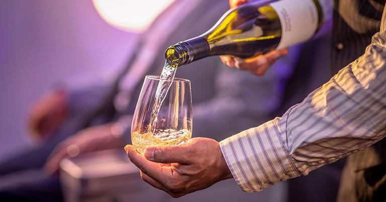


![Passenger Pops Open Champagne Mid-Flight—That Didn’t Go Over Quietly [Roundup]](https://viewfromthewing.com/wp-content/uploads/2025/03/passenger-pops-champagne.jpg?#)


![[Podcast] Should Brands Get Political? The Risks & Rewards of Taking a Stand with Jeroen Reuven Bours](https://justcreative.com/wp-content/uploads/2025/03/jeroen-reuven-youtube-1.png)
![[Podcast] Should Brands Get Political? The Risks & Rewards of Taking a Stand with Jeroen Reuven](https://justcreative.com/wp-content/uploads/2025/03/jeroen-reuven-youtube.png)


Wolf-Gordon BLUE: Surface Design Through a Fashion Editorial Lens
Wolf-Gordon BLUE: Surface Design Through a Fashion Editorial LensSurfaces speak. They communicate through texture, pattern, and color. Wolf-Gordon’s BLUE collection transforms walls from passive boundaries into expressive canvases that shape atmosphere and narrative...
Surfaces speak. They communicate through texture, pattern, and color. Wolf-Gordon’s BLUE collection transforms walls from passive boundaries into expressive canvases that shape atmosphere and narrative within spaces.
Designer: Wolf-Gordon
The collection’s name carries historical weight. Blue pigments remained rare in nature for centuries, making them precious in art and design. This cultural significance provides BLUE with a conceptual foundation beyond mere decoration. Fashion photography’s editorial perspective inspired this collection. These patterns tell visual stories through walls.
The Editorial Eye: Surfaces as Protagonists
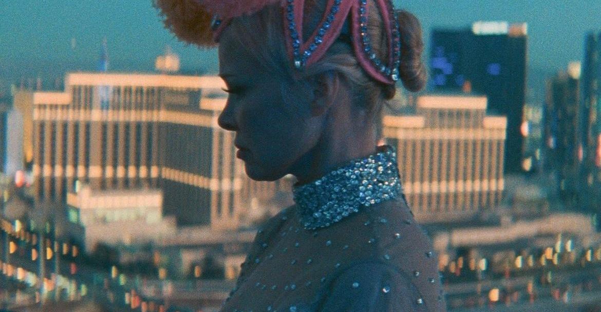
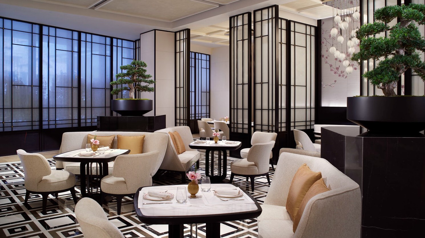
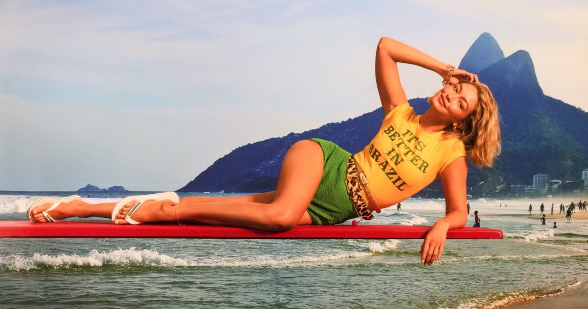
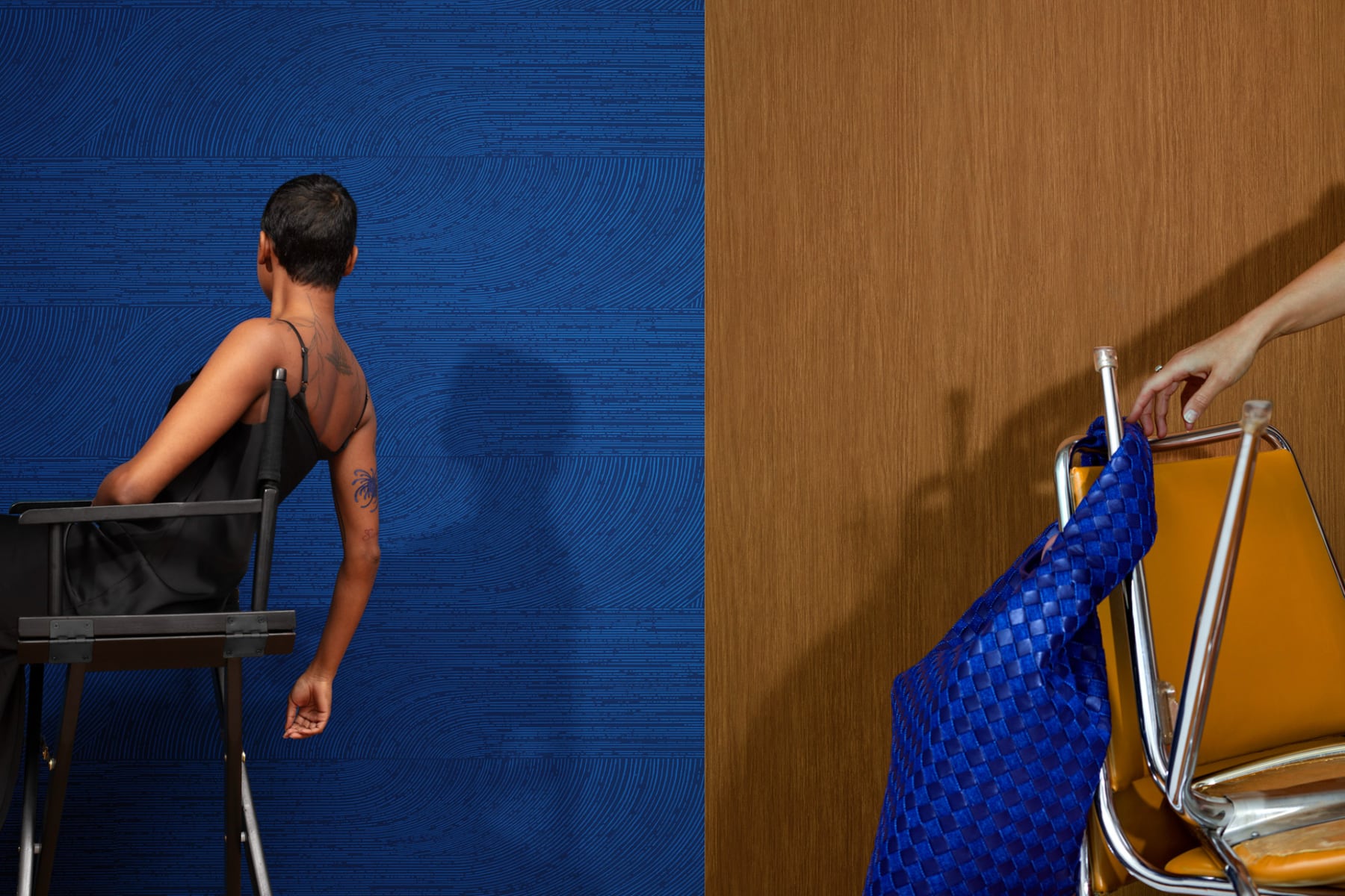
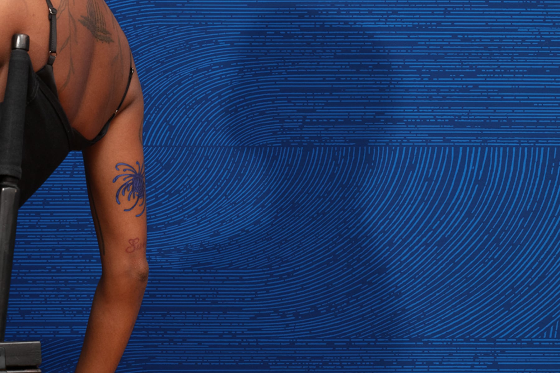
Wolf-Gordon translates fashion’s visual language into spatial design with remarkable clarity. One striking photograph shows a person seated against a deep blue wallcovering with intricate flowing lines creating rhythmic movement. The pattern—likely “Awaken”—actively participates in the composition, establishing a dialogue with the figure.
This approach mirrors editorial fashion photography’s treatment of environments. The wallcovering becomes a character in the scene.

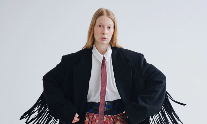
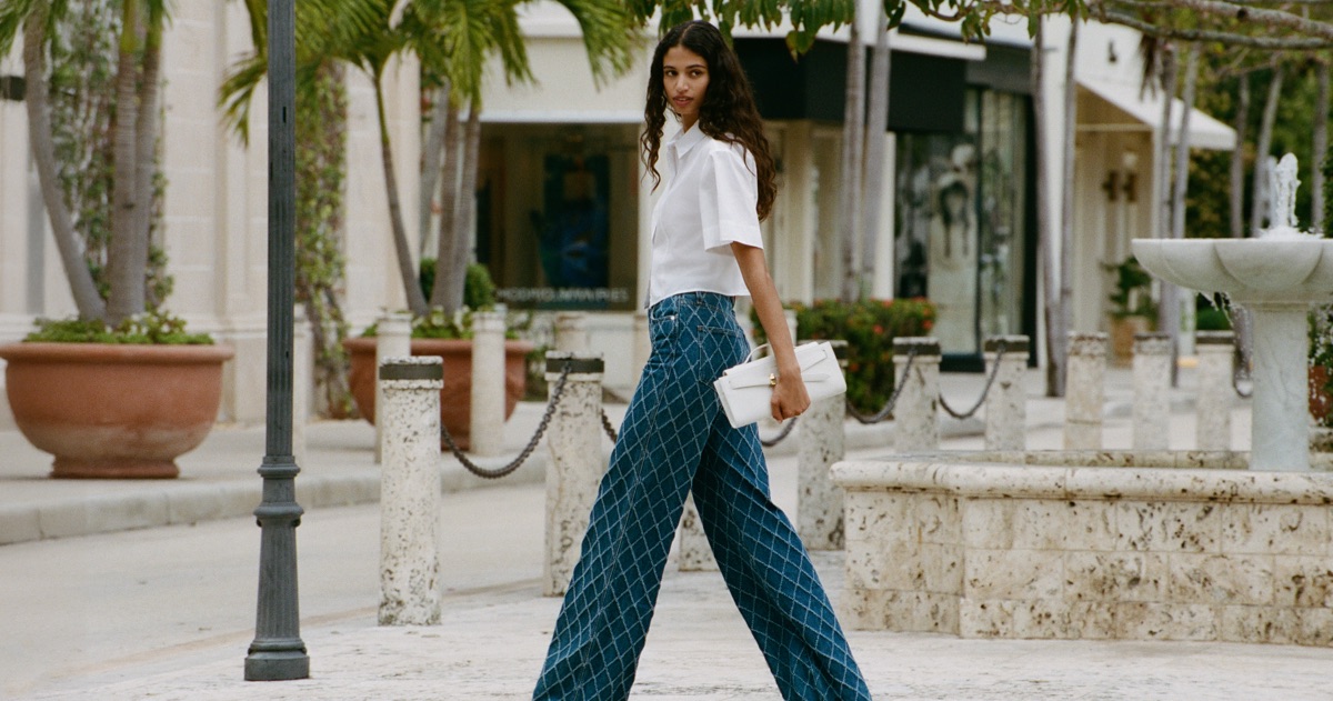
A geometric grey pattern—possibly “Rock Ledge”—creates dimensional interest, against which a silver luggage piece and bright blue shoes serve as punctuation points. The careful styling reflects the fashion editorial’s meticulous attention to every element.
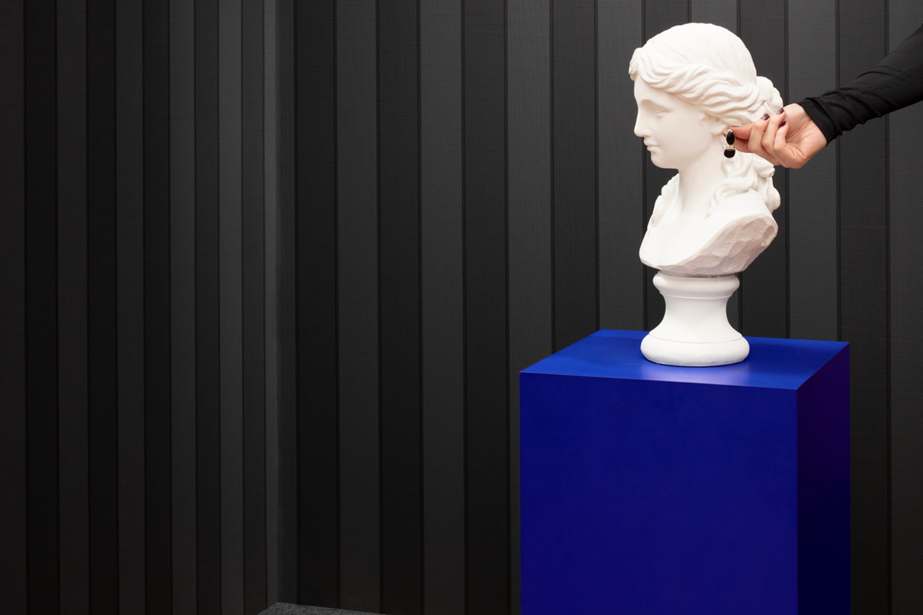
The collection’s range becomes apparent across multiple images. From the rich, dimensional blue of “Awaken” to the subtle vertical striations of what appears to be “Highline” in a sophisticated black colorway behind a classical bust on a vibrant blue pedestal, each pattern generates its own spatial energy.
Pattern Personalities
Every pattern in the BLUE collection possesses a distinct character. The deep blue curvilinear design—”Awaken”—evokes fluid movement and organic energy. Its hand-inked lines draw inspiration from fingerprints and tree rings, bringing a human touch to walls.
The geometric grey pattern represents “Rock Ledge,” with its sculpted tile appearance creating visual dimension without actual relief. This trompe l’oeil effect plays with perception, engaging viewers beyond the mere visual.
A warm wood grain pattern—presumably “Forest”—brings natural warmth to interiors. Its vertical orientation draws the eye upward, enhancing spatial perception.
Several images showcase the collection’s more subtle offerings—”Cloth” with its fine linen-like texture, “Dune” with its grasscloth inspiration, and “Ritz” with its vertical striae emboss. These quieter patterns demonstrate versatility without sacrificing sophistication.
Chromatic Storytelling
The collection name BLUE manifests throughout the imagery. Deep blue appears in the dramatic wallcovering, accessories like gloves and bracelets, furniture accents, and a striking lamp base.
This strategic use of blue creates visual continuity across diverse patterns and settings. It functions as a narrative thread connecting different spaces, similar to how fashion editorials might use recurring color elements to unify a multi-page spread.
Neutral colorways—warm woods, sophisticated greys, subtle beiges, and rich browns—provide versatile backgrounds for creative expression through furnishings. This approach grants designers flexibility while maintaining the collection’s cohesive identity.
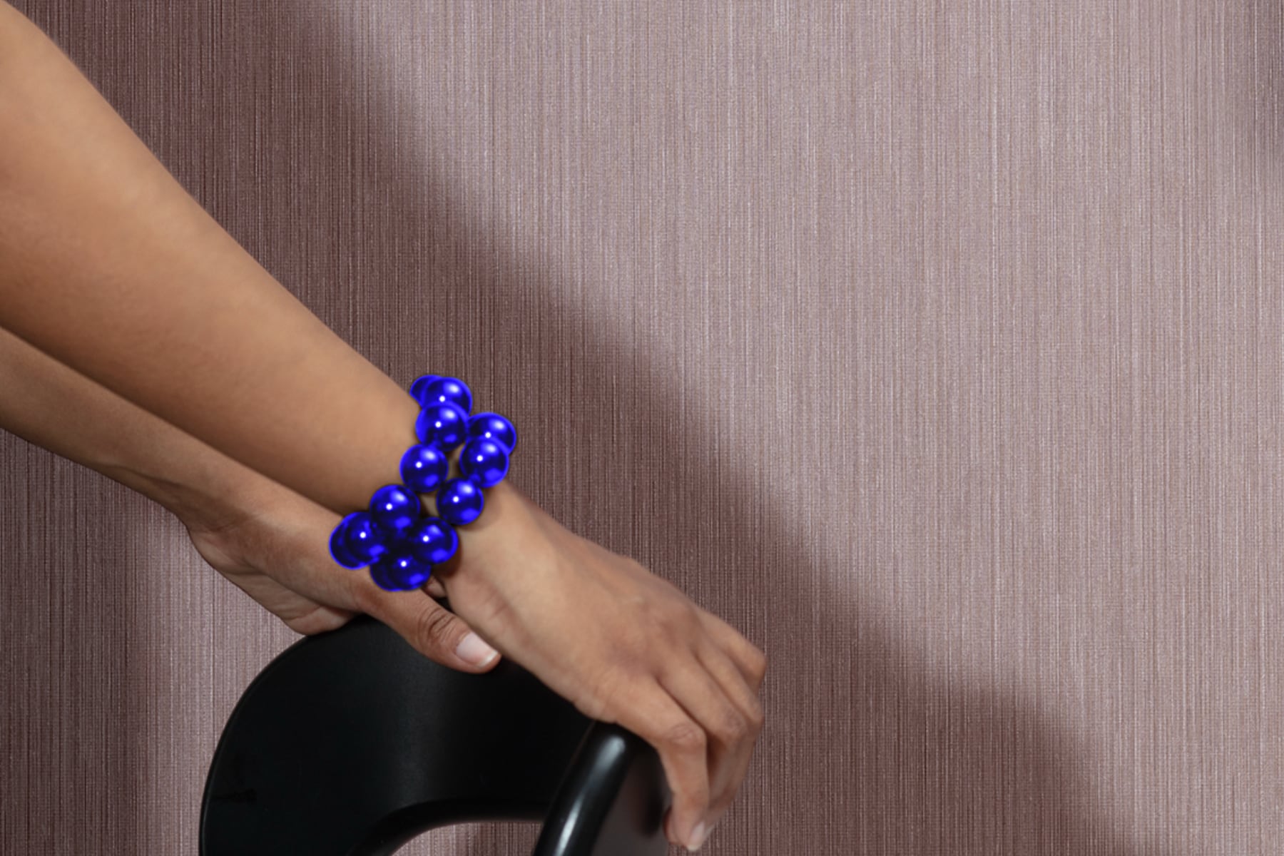
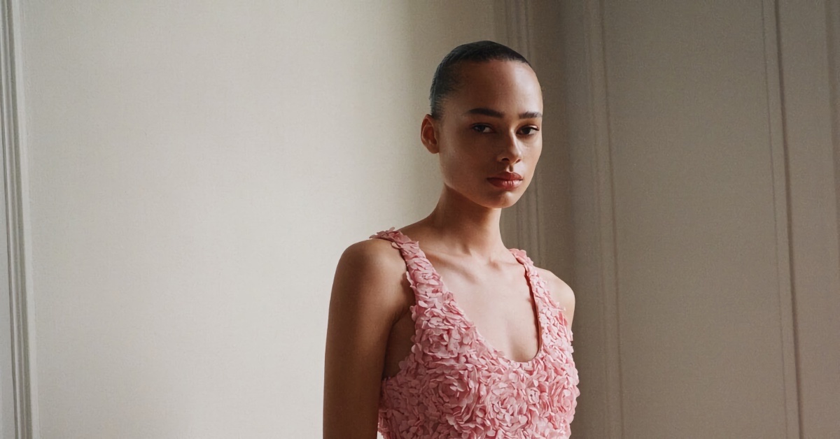
A mauve-tinted wallcovering serves as a backdrop for an arm adorned with vibrant blue beaded bracelets, creating dramatic visual punctuation. This moment captures the collection’s stated aim of balancing “the refined and subtle” with “hints of surprise.”
Fashion-Forward Styling
The presentation styling merits close examination. Wolf-Gordon embraces fashion photography’s editorial perspective in both the patterns themselves and their presentation context.
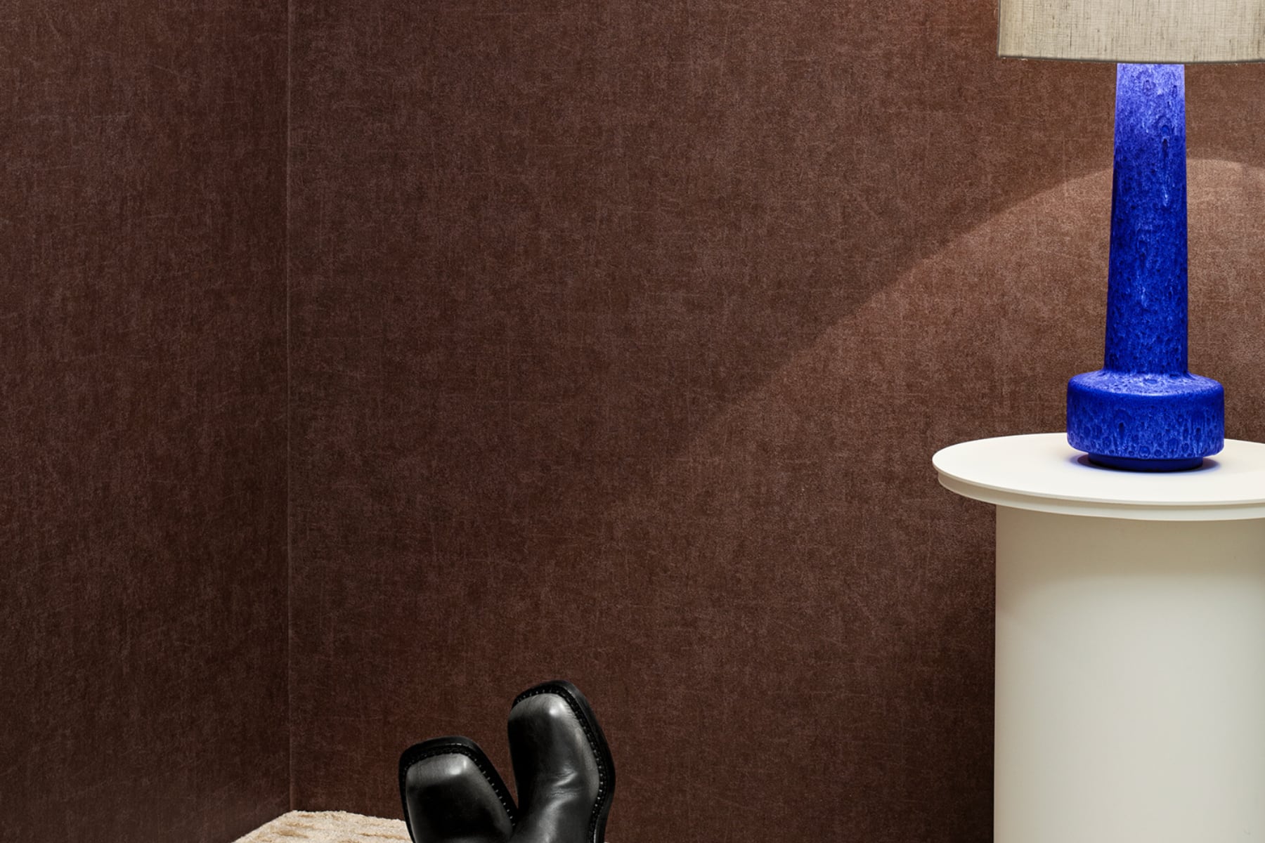
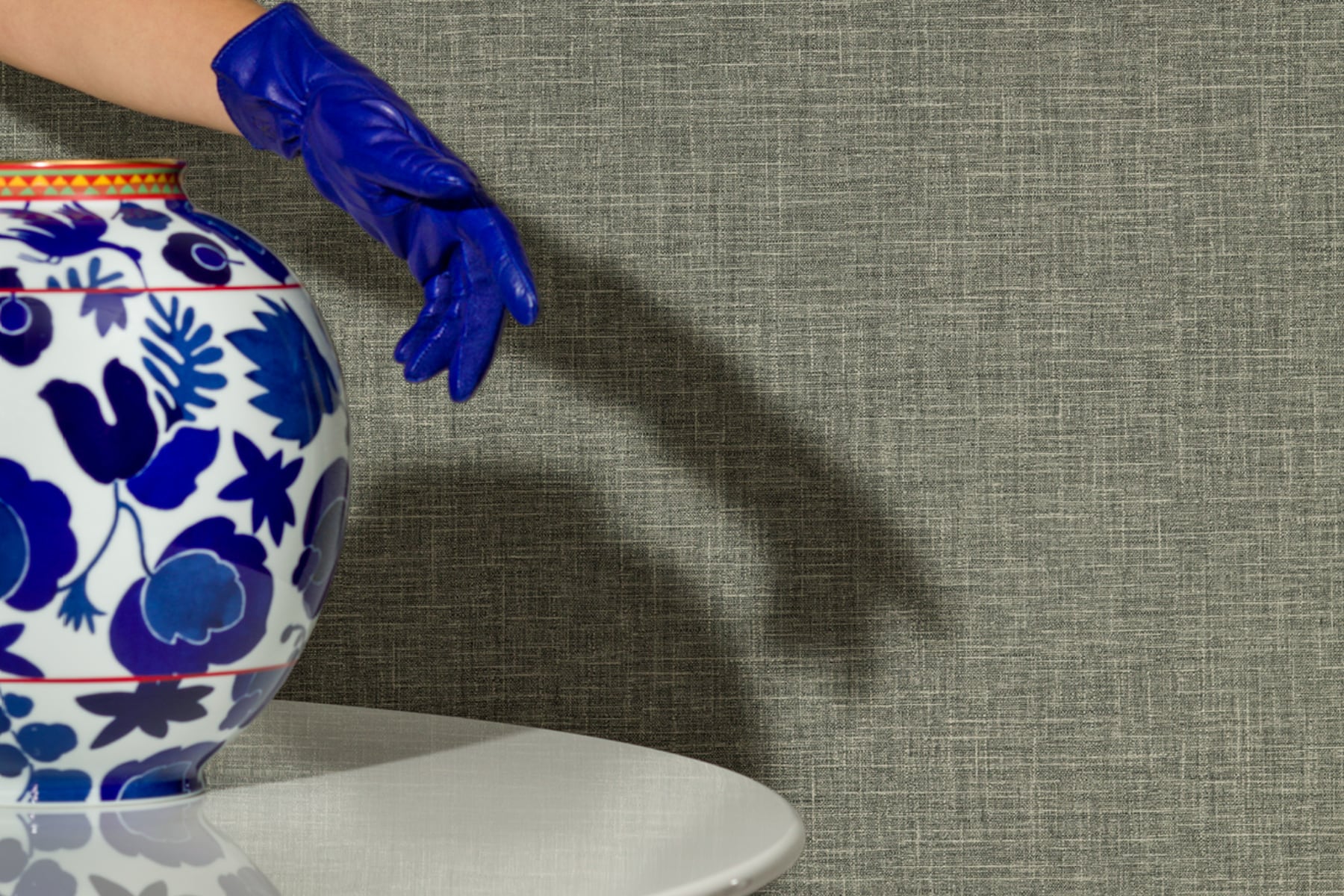
Carefully chosen accessories appear throughout: bright blue shoes, a woven blue bag, gloves, and bracelets. These elements establish a visual dialogue with the wallcoverings. A blue ceramic vase with a white pattern references the collection’s name while introducing contrast. A blue lamp base functions as a sculptural element against a rich brown wallcovering.
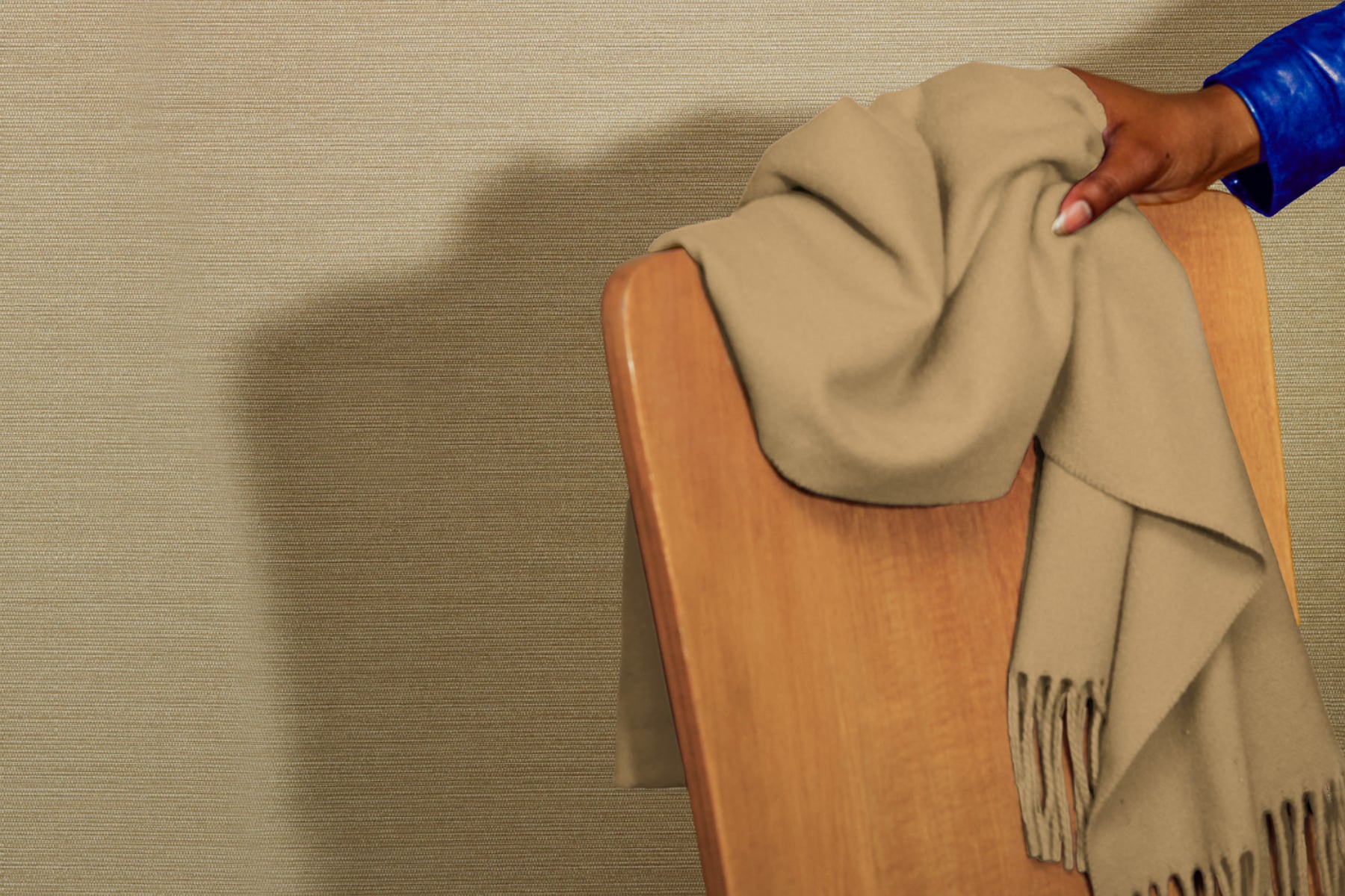
The styling creates narrative moments. A hand placing a scarf on a wooden chair against a textured beige background suggests human presence and everyday luxury. A figure pulling a silver suitcase against a geometric grey pattern evokes travel and transition.
Material Sophistication
The images reveal subtle material qualities that photography captures perfectly. Light plays across surfaces differently, catching metallic accents in some patterns and highlighting textural depth in others.
Texture variations appear throughout the collection. Some patterns feature pronounced tactile qualities, while others offer visual texture through color and pattern. This range provides designers with tools for creating multi-sensory environments.
Each pattern responds differently to light. The deep blue “Awaken” pattern absorbs and reflects light in ways that enhance its dimensional quality. The subtle vertical striations of other patterns create gentle shadow play.
Spatial Narratives
The collection transforms spaces into narratives. A brown wallcovering creates a cocoon-like environment for relaxation, enhanced by the blue lamp. The geometric grey pattern establishes a sophisticated transit zone. The dramatic blue pattern generates an immersive environment that commands attention.
This narrative quality aligns with contemporary hospitality design, where spaces must tell stories and create memorable experiences. BLUE offers designers tools for crafting these spatial narratives with sophistication.
Wolf-Gordon’s understanding of how surfaces affect spatial perception shines throughout. Vertical patterns enhance ceiling height. Textural patterns add depth to walls. Subtle patterns create breathing room. Bold patterns establish focal points.
Beyond Aesthetics: A New Design Language
While the images highlight aesthetic qualities, Wolf-Gordon’s reputation for “dependable performance” suggests these wallcoverings meet rigorous standards for commercial applications. The company’s history since 1967 includes expansion into wall protection, upholstery textiles, paints, and specialty coatings—all united by excellent design and performance.
This matters tremendously in hospitality environments. Beautiful wallcoverings must be performed in high-traffic settings. The BLUE collection positions itself for sophisticated hospitality interiors where durability equals aesthetics in importance.
BLUE introduces a design language that bridges fashion and interior design. It recognizes walls as active participants in spatial experience rather than passive backgrounds. This perspective shift opens new possibilities for how designers approach surface design.
The collection acknowledges the growing importance of surfaces in creating distinctive environments. By drawing inspiration from fashion photography’s editorial perspective, BLUE positions wallcoverings as active participants in spatial storytelling.
This approach changes how we think about walls. And that represents genuine innovation in surface design.
The post Wolf-Gordon BLUE: Surface Design Through a Fashion Editorial Lens first appeared on Yanko Design.