![Battle Hordes of Alien Horrors in Survival Shooter ‘Let Them Come: Onslaught’ [Trailer]](https://bloody-disgusting.com/wp-content/uploads/2025/03/letthemcome.jpg)


![Please Watch Carefully [THE HEART OF THE WORLD]](http://www.jonathanrosenbaum.net/wp-content/uploads/2018/05/the-heart-of-the-world-5-300x166.jpg)


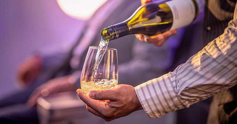


![Passenger Pops Open Champagne Mid-Flight—That Didn’t Go Over Quietly [Roundup]](https://viewfromthewing.com/wp-content/uploads/2025/03/passenger-pops-champagne.jpg?#)


![[Podcast] Should Brands Get Political? The Risks & Rewards of Taking a Stand with Jeroen Reuven Bours](https://justcreative.com/wp-content/uploads/2025/03/jeroen-reuven-youtube-1.png)
![[Podcast] Should Brands Get Political? The Risks & Rewards of Taking a Stand with Jeroen Reuven](https://justcreative.com/wp-content/uploads/2025/03/jeroen-reuven-youtube.png)


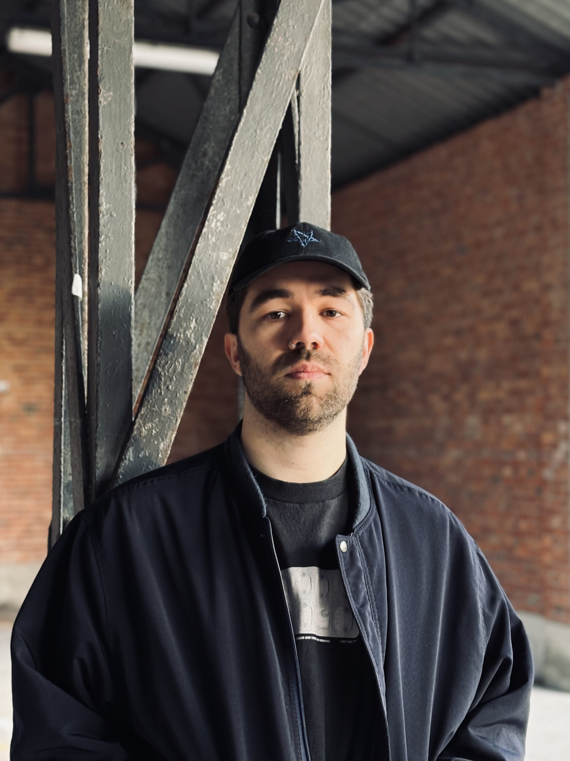


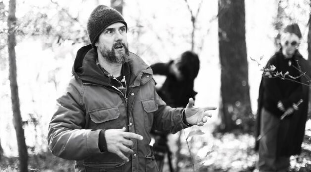
Crafting the Title Sequence for Disney+’s “Agatha All Along” with Perception’s Christian Haberkern
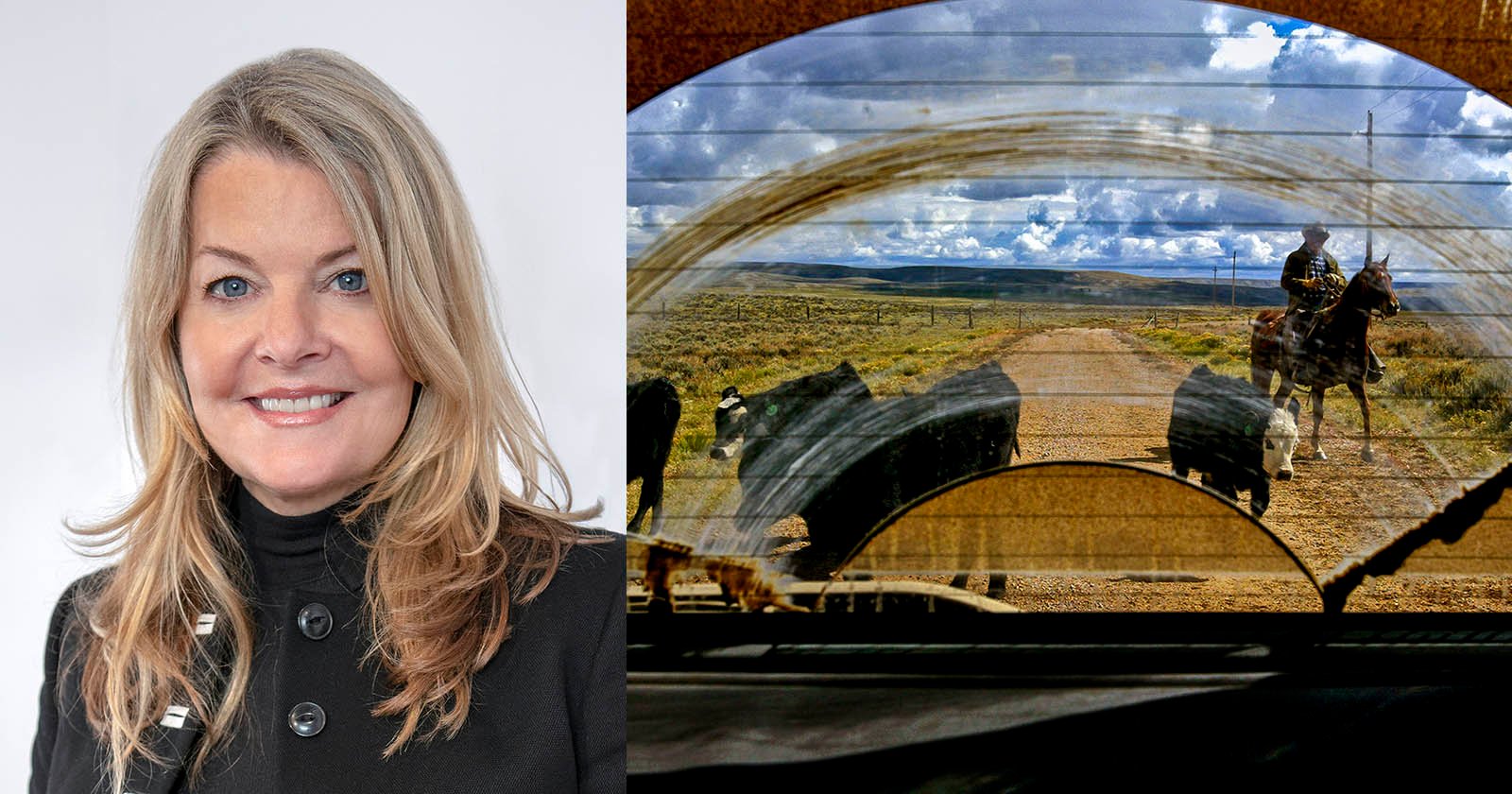
This post was written by Michelle Gallina and originally appeared on the Adobe blog on March 5, 2025.The series pays homage to witches throughout history, setting an eerie tone from the beginning with its intricate title sequence. We sat down with Christian Haberkern, Art Director at the Emmy-nominated design lab Perception and Agatha All Along title designer, to learn more about his work using Premiere Pro and After Effects to craft both the main title sequence and an "Agnes of Westview" parody title sequence that appears within the series.For the main sequence, Haberkern and the Perception team highlighted representations of witches over time, incorporating various pieces of mixed media. In addition to illustrations of the Salem Witch Trials, newspaper articles and modern pop culture references from other TV shows like Bewitched and The Wizard of Oz, Haberkern organized a local film shoot in the mountains of North Carolina to create totally custom assets for the sequence.How did you first get into title design? What drew you to it?Christian Haberkern: I first studied title design at the Savannah College of Art & Design, where we explored the work of legends like Saul Bass and Maurice Binder, analyzing iconic films such as Psycho, North by Northwest, and the James Bond series. I was deeply inspired by the way design, editing, and motion seamlessly came together in those graphics. Later, I saw the main titles for Se7en, created by Prologue, and was completely captivated by the textures they captured on the props. That moment really pushed me toward pursuing this field, and eventually, I was hired at Perception, where I began working on title sequences myself!What was the inspiration behind your title sequence? What were you trying to achieve?CH: We drew inspiration from archival records of witches throughout history, aiming to craft an eerie atmosphere without veering into a horror vibe. In the Parody sequence, we emphasize the town of Westview, incorporating quick Tyler Durden-style cuts of witches lying lifeless on the ground. In the first episode, Agatha takes on the role of a detective in a true crime drama, which is a nod to the HBO miniseries Mare of Easttown (2021). To symbolize Agatha’s real-world influence seeping into the fabricated TV reality, we staged a “yellow brick road” made of police tape, signaling the merging of these two worlds.How did you begin this project? Can you talk about the collaborative process with the director and the process of creating the sequence from start to finish?CH: We presented the client with several design directions, and they gravitated most toward a multimedia approach exploring the history of witches. This concept incorporated archival illustrations from the Salem witch trials, along with photos, newspaper clippings, and references to real historical witches, as well as iconic TV shows and films like Bewitched and The Wizard of Oz. We had a lot of fun gathering references and researching historical events to find any relevant material. Since all of this was happening around October, the approaching Halloween season naturally helped set the mood and fuel our creativity.Describe your favorite part or component of the title sequence. How did it come together and how did you achieve it?CH: After scouring the internet for as much archival material as we could find, we quickly realized our asset library was quite limited, and many of the images we discovered were copyrighted. Faced with this challenge, we decided to create our own custom assets. We organized a film shoot and reached out to friends in my town and dressed them as witches. I asked a few local people for help, and they in turn brought in their friends — before we knew it, we had an entire coven ready to join us for the shoot. We spent a couple of days filming in the mountains of North Carolina, capturing shots of our witch friends in the woods. While filming, we also set up the yellow tape for the parody sequence and captured that footage as well. We then treated the footage to give it the authentic feel of real archival found footage.What were some specific challenges you faced in making this sequence? How did you go about solving them?CH: One of the biggest challenges of the project was finding suitable filming locations. Fortunately, I own property nestled within the Nantahala National Forest, so we were able to shoot part of the project right on my land.What Adobe tools did you use on this project and why did you originally choose them? Were there any other third-party tools that helped enhance your workflow?CH: We are huge After Effects and Premiere Pro users at Perception, as most of our projects run through these tools. For the visual effects and compositing in this sequence, I used Mocha Pro to track footage and create precise masks.If you could share one tip about Premiere Pro or After Effects, what would it be?CH: One of my favorite things about Premiere Pro and After Effects is the integration

This post was written by Michelle Gallina and originally appeared on the Adobe blog on March 5, 2025.
The series pays homage to witches throughout history, setting an eerie tone from the beginning with its intricate title sequence. We sat down with Christian Haberkern, Art Director at the Emmy-nominated design lab Perception and Agatha All Along title designer, to learn more about his work using Premiere Pro and After Effects to craft both the main title sequence and an "Agnes of Westview" parody title sequence that appears within the series.
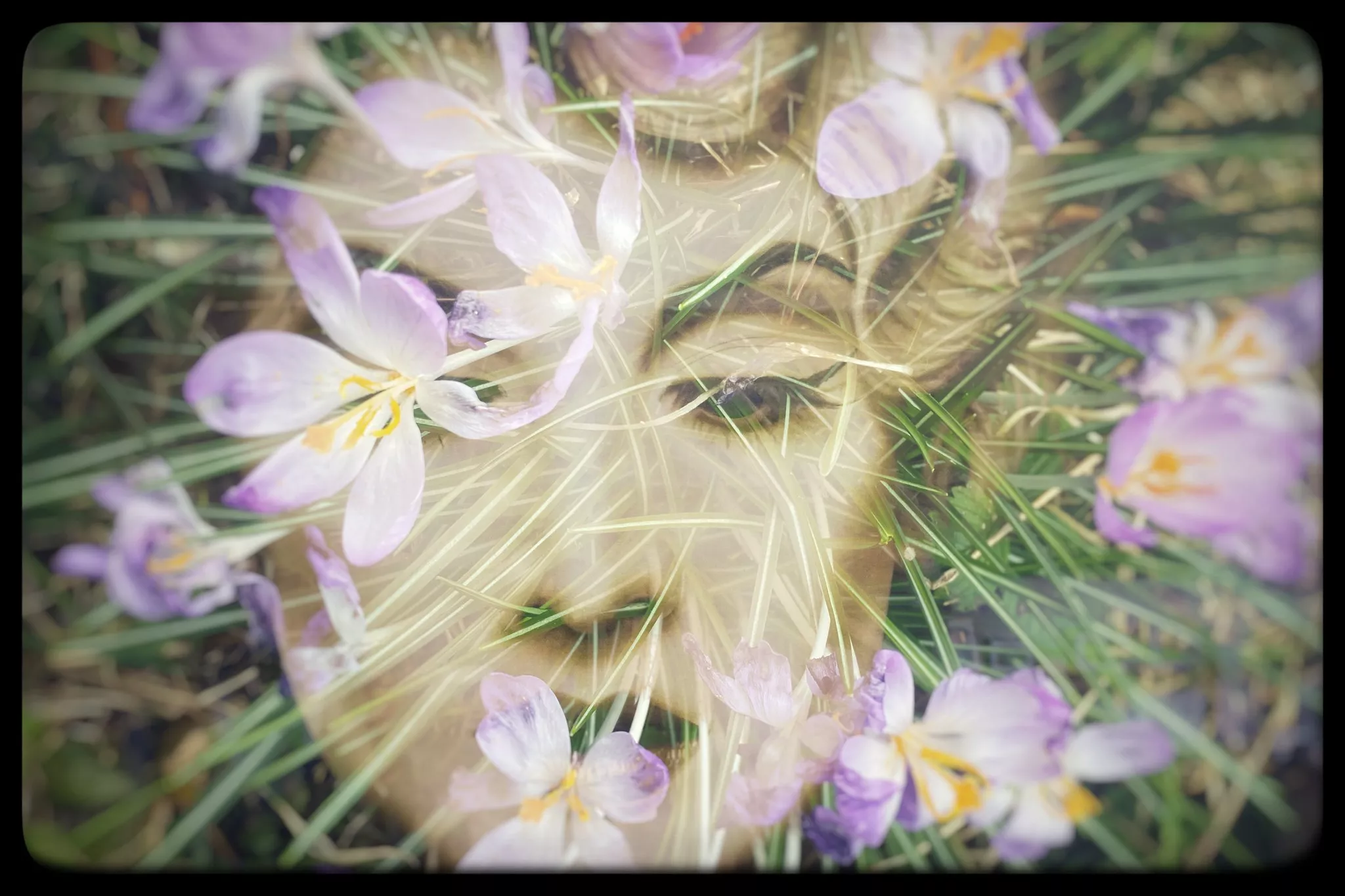
For the main sequence, Haberkern and the Perception team highlighted representations of witches over time, incorporating various pieces of mixed media. In addition to illustrations of the Salem Witch Trials, newspaper articles and modern pop culture references from other TV shows like Bewitched and The Wizard of Oz, Haberkern organized a local film shoot in the mountains of North Carolina to create totally custom assets for the sequence.
How did you first get into title design? What drew you to it?
Christian Haberkern: I first studied title design at the Savannah College of Art & Design, where we explored the work of legends like Saul Bass and Maurice Binder, analyzing iconic films such as Psycho, North by Northwest, and the James Bond series. I was deeply inspired by the way design, editing, and motion seamlessly came together in those graphics. Later, I saw the main titles for Se7en, created by Prologue, and was completely captivated by the textures they captured on the props. That moment really pushed me toward pursuing this field, and eventually, I was hired at Perception, where I began working on title sequences myself!
What was the inspiration behind your title sequence? What were you trying to achieve?
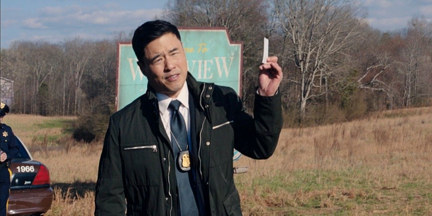
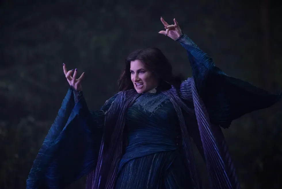
CH: We drew inspiration from archival records of witches throughout history, aiming to craft an eerie atmosphere without veering into a horror vibe. In the Parody sequence, we emphasize the town of Westview, incorporating quick Tyler Durden-style cuts of witches lying lifeless on the ground. In the first episode, Agatha takes on the role of a detective in a true crime drama, which is a nod to the HBO miniseries Mare of Easttown (2021). To symbolize Agatha’s real-world influence seeping into the fabricated TV reality, we staged a “yellow brick road” made of police tape, signaling the merging of these two worlds.
How did you begin this project? Can you talk about the collaborative process with the director and the process of creating the sequence from start to finish?
CH: We presented the client with several design directions, and they gravitated most toward a multimedia approach exploring the history of witches. This concept incorporated archival illustrations from the Salem witch trials, along with photos, newspaper clippings, and references to real historical witches, as well as iconic TV shows and films like Bewitched and The Wizard of Oz. We had a lot of fun gathering references and researching historical events to find any relevant material. Since all of this was happening around October, the approaching Halloween season naturally helped set the mood and fuel our creativity.
Describe your favorite part or component of the title sequence. How did it come together and how did you achieve it?
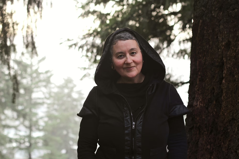
CH: After scouring the internet for as much archival material as we could find, we quickly realized our asset library was quite limited, and many of the images we discovered were copyrighted. Faced with this challenge, we decided to create our own custom assets. We organized a film shoot and reached out to friends in my town and dressed them as witches. I asked a few local people for help, and they in turn brought in their friends — before we knew it, we had an entire coven ready to join us for the shoot. We spent a couple of days filming in the mountains of North Carolina, capturing shots of our witch friends in the woods. While filming, we also set up the yellow tape for the parody sequence and captured that footage as well. We then treated the footage to give it the authentic feel of real archival found footage.
What were some specific challenges you faced in making this sequence? How did you go about solving them?
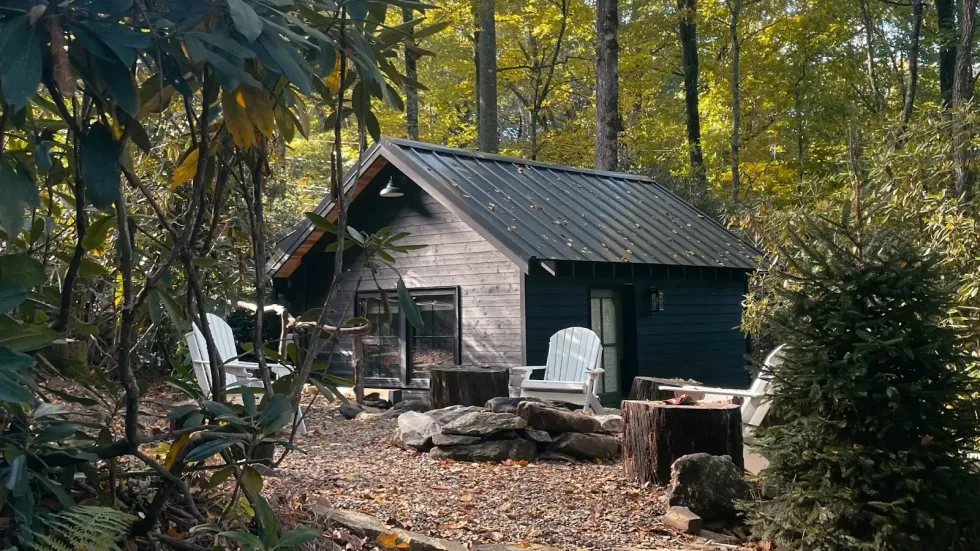
CH: One of the biggest challenges of the project was finding suitable filming locations. Fortunately, I own property nestled within the Nantahala National Forest, so we were able to shoot part of the project right on my land.
What Adobe tools did you use on this project and why did you originally choose them? Were there any other third-party tools that helped enhance your workflow?
CH: We are huge After Effects and Premiere Pro users at Perception, as most of our projects run through these tools. For the visual effects and compositing in this sequence, I used Mocha Pro to track footage and create precise masks.
If you could share one tip about Premiere Pro or After Effects, what would it be?
CH: One of my favorite things about Premiere Pro and After Effects is the integration with Dynamic Link that they both share. As both a visual effects artist and editor, it allows me to effortlessly switch between the two programs and work on any sequence I need, streamlining my workflow.
Who is your creative inspiration and why?
CH: There are so many, where do I start? Neo-noir classics like Blade Runner (1982) and Le Samouraï (1967) are fantastic for studying color, composition, and the intentional storytelling through camera placement and movement. I’m also a huge Spielberg fan — his ability to pack a deeper narrative into each shot never fails to give me chills. And of course, the new Blade Runner, shot by Roger Deakins, is a masterpiece. I actually went through that film frame by frame and put grids over it so I could gain more insight into the composition and lighting.
What’s the toughest thing you’ve had to face in your career and how did you overcome it? What advice do you have for people aspiring to get into the motion design space?
CH: When I first started out, I was freelancing with various studios in NYC. The biggest challenge — and also what helped me grow the most — was the intense competition for freelance gigs. There were so many talented freelancers around me and a lot of pressure to perform at the job and that really pushed me to hone my skills very quickly.
What’s your favorite thing about your workspace and why?
CH: One of the things I love most about my workspace is that, like all my motion design projects, it’s custom — I built it myself. I’m also lucky to be surrounded by nature, and on beautiful days, I open all the windows to let in the fresh mountain air while I work. Also, I have fiber internet!