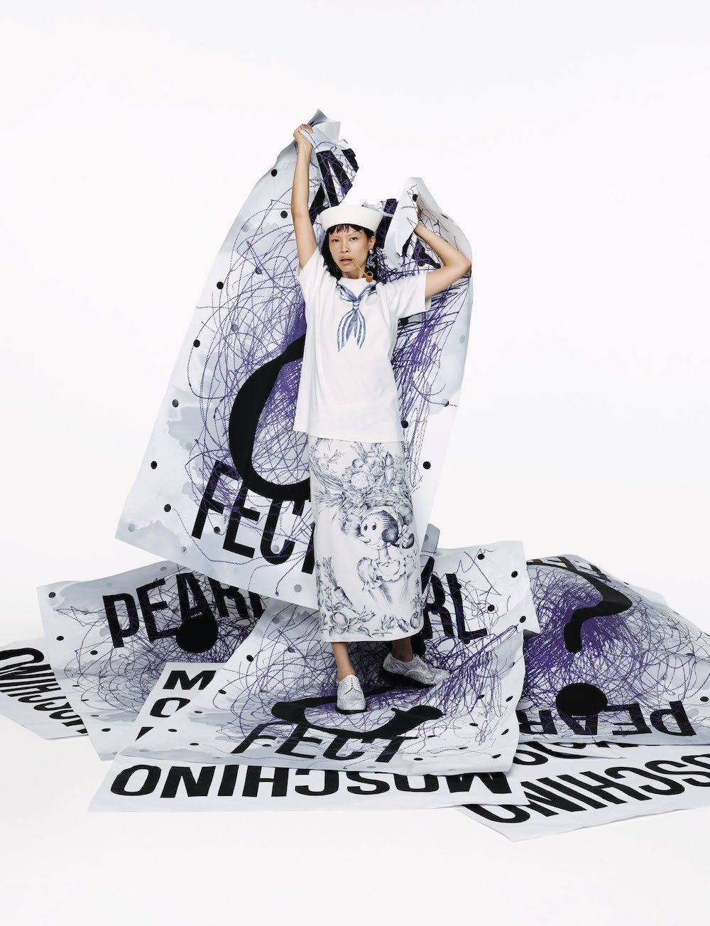


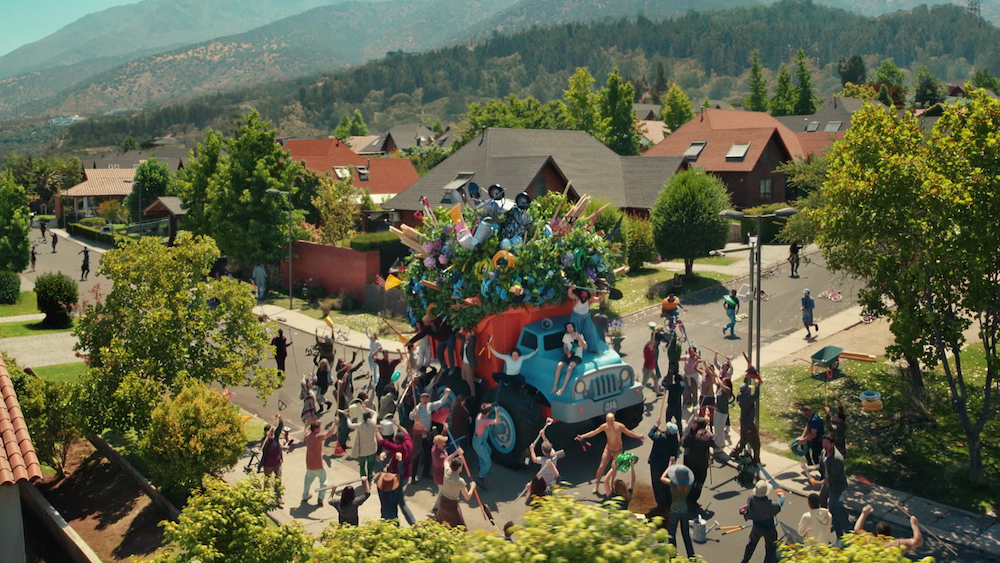


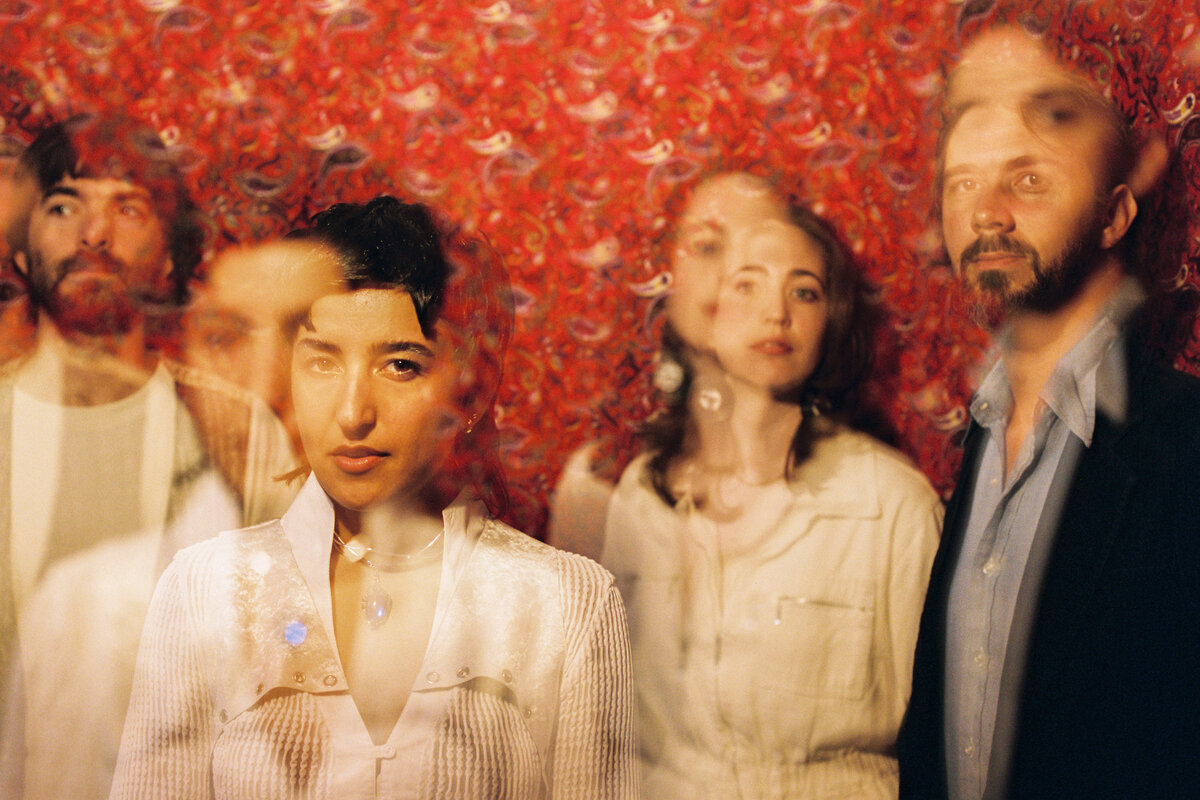

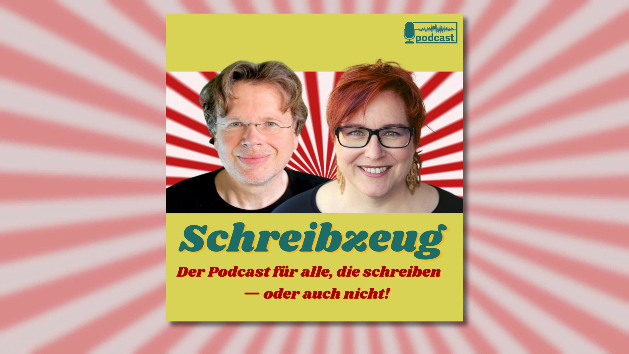


Spiegel der Kultur: Die Monotype Type Trends 2025
Die Type Trends sind da – und nehmen 2025 eine neue Form an. Wir sprechen im Interview mit Monotypes Executive Creative Directors Charles Nix und Phil Garnham über den Wandel in der Typobranche und das neue Report-Konzept
Die Type Trends sind da – und nehmen 2025 eine neue Form an. Wir sprechen im Interview mit Monotypes Executive Creative Directors Charles Nix und Phil Garnham über den Wandel in der Typobranche und das neue Report-Konzept
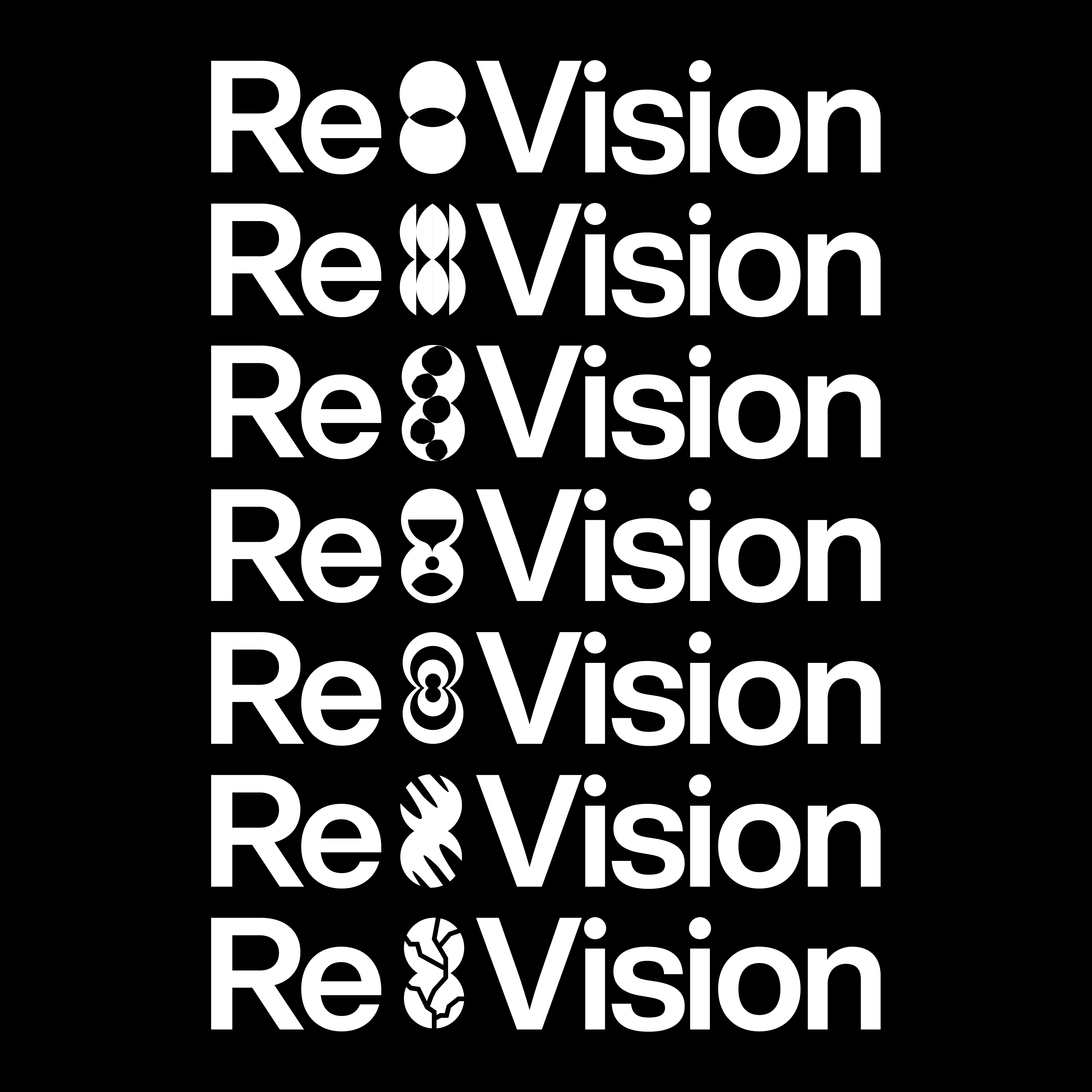
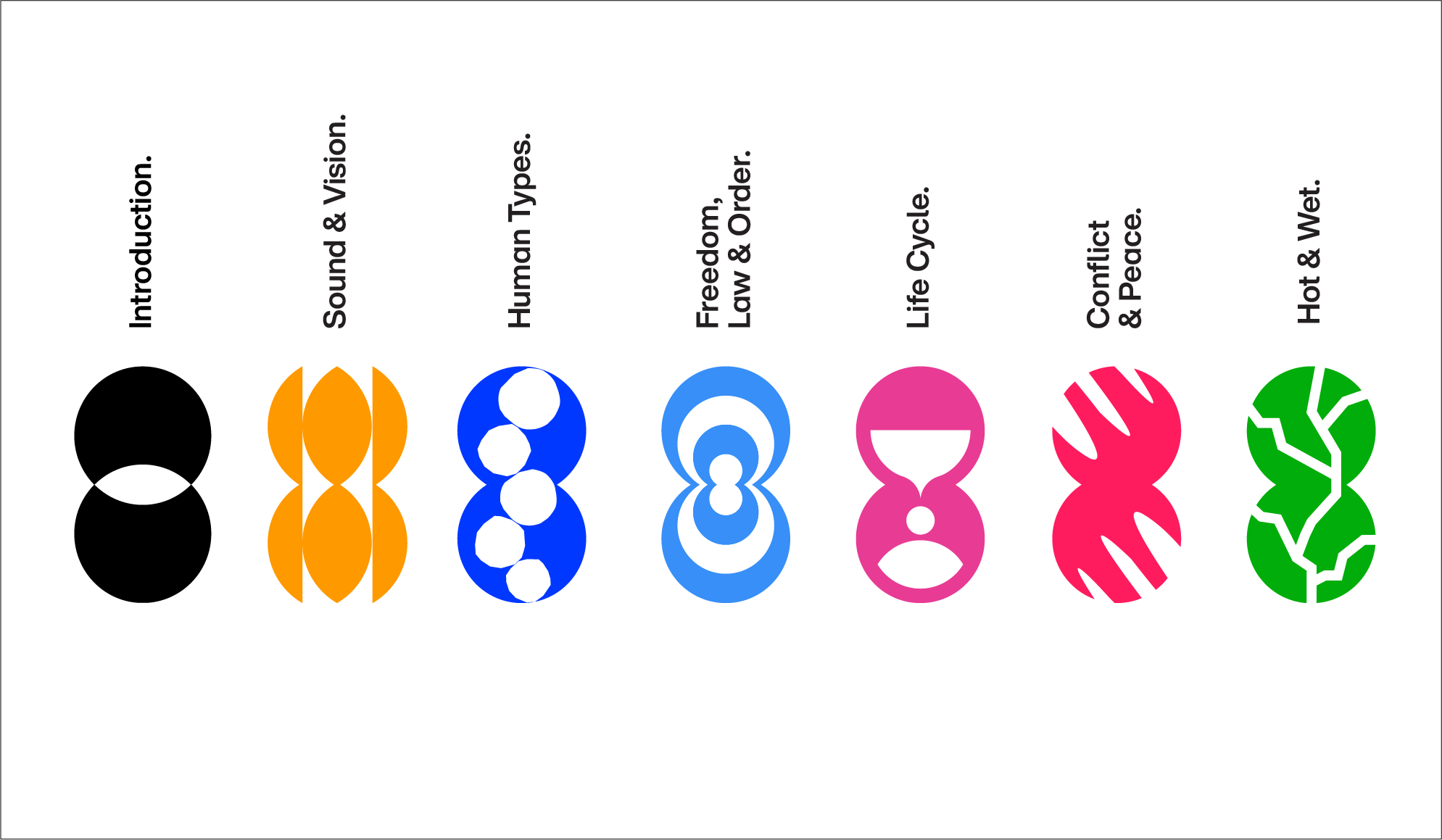
 Typografie war schon immer mehr als nur Ästhetik. Sie ist Ausdruck von Kultur und Kommunikation. Deshalb sollen die Monotype Type Trends 2025 eine neue Form annehmen: Ausgangspunkt ist der übliche Bericht zu sechs Trendthemen, die die Welt bewegen, und ihrem Bezug zur Typografie. Daraus entwickeln sich im Laufe des Jahres sechs »Activations«, bei denen Monotype mit Agenturen und Kreativen zusammenarbeitet, um die einzelnen Trends in Szene zu setzen – und zu hinterfragen.
Wir haben mit Phil Garnham, Executive Creative Director, und Charles Nix, Senior Executive Creative Director, über diesen Wandel, ihre Vision für die Typobranche und die Trendthemen gesprochen, die sie mit der Design-Community diskutieren wollen.
Zur englischen Version / Skip to English version
Vom Trendbericht zum Manifest
Fangen wir mit dem Bericht selbst an. Wie lange arbeitet ihr schon daran?
Phil: Gefühlt seit drei oder vier Jahren! Schon als Charles und ich am Trendbericht 2021 gearbeitet haben, haben wir gemerkt, dass sich etwas verändert. Damals war das Ganze noch sehr kuratorisch, aber wir haben realisiert, dass Typografie immer enger mit Brand Design, Strategie und dem kulturellen Kontext verknüpft ist.
Charles: Wir haben damals ein gemeinsames Dokument angelegt, um Ideen zu sammeln, Geschichten zu kuratieren und Gedanken auszutauschen. Wobei ich sagen muss: Auch wenn Phil und ich als Autoren genannt werden, war das ein echtes Teamprojekt. Als Creative Directors waren wir mehr so eine Art Wegweiser – wir haben das Team unterstützt, motiviert und diesen neuen Denkansatz gefördert.
Für uns spiegelt der Bericht auch wider, wie sich unsere Rolle bei Monotype verändert hat. Wir wollen nicht mehr nur Trends auflisten, sondern aktiv eine führende Rolle übernehmen – im Austausch mit kulturellen und strategischen Entwicklungen.
PAGE: Es geht also nicht mehr nur um Trends?
Charles: Genau. Typische Trendberichte kratzen oft nur an der Oberfläche. Sie sind zwar beliebt, aber selten tiefgründig. Wir wollten etwas schaffen, das mehr Substanz hat – etwas, das die Design-Community mit der Welt da draußen verbindet.
Phil: Außerdem sind wir Designer:innen ja strategische Denker:innen. Es fühlt sich irgendwie falsch an, immer nur zurückzuschauen, wenn wir eigentlich nach vorne blicken sollten. Neue Fragen stellen: Wie können wir Dinge beeinflussen, die unsere Welt verändern? Wie kann Typografie ein Motor für Veränderung sein?
Activations: Vom Bericht zur Praxis
PAGE: Mit dem diesjährigen Bericht führt ihr auch das Konzept der Activations ein. Wie können wir uns das vorstellen?
Charles: Der Bericht ist der Startschuss – quasi der erste Impuls fürs Jahr. Stellt ihn euch wie eine Einladung zu einer Party vor, auf der wir die wichtigsten Themen und Fragen vorstellen, die uns beschäftigen werden.
Phil: Die Aktivierungen setzen diese Ideen dann in die Praxis um. Sie finden fast monatlich statt und basieren auf Kooperationen mit Kreativen aus der ganzen Welt. Der Bericht wird so zu etwas Lebendigem, das sich ständig weiterentwickelt – und das nicht nur 2025, sondern auch darüber hinaus.
Charles: Die erste Aktivierung dreht sich zum Beispiel um das Zusammenspiel von Multimedia und Typografie. Wir arbeiten mit AudioSocket zusammen, um herauszufinden, wie Schrift und Klang mithilfe von KI miteinander interagieren können. Ohne zu viel zu verraten: Es geht darum, Schrift und Sound auf frische, unerwartete Weise miteinander zu verschmelzen.
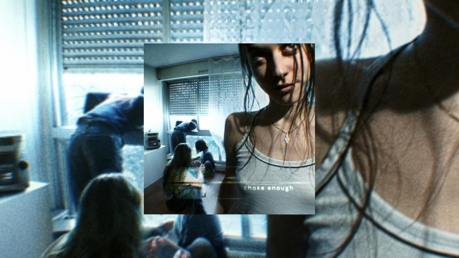
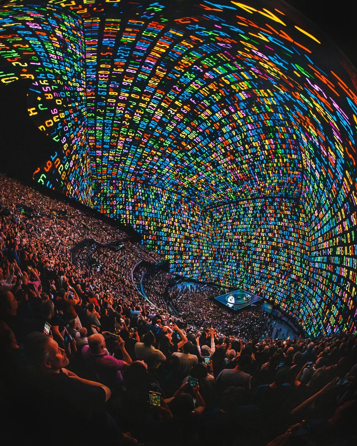
Sound & Vision: Schrift in Bewegung
PAGE: Klang und Typografie – das ist eine eher ungewöhnliche Kombination. Wird Schrift nicht meistens als »stilles« Designelement wahrgenommen?
Phil: Stimmt, genau deshalb wollten wir uns das mal genauer anschauen. Typografie ist überall, aber weil wir so daran gewöhnt sind, nehmen wir sie oft gar nicht mehr bewusst wahr – selbst fette Display-Schriften können irgendwie leise wirken. Mit dieser Aktivierung wollen wir herausfinden, wie Schrift interagieren, sich bewegen und weiterentwickeln kann.
Charles: Typografie hat ja auch eine eigene Musikalität. Von Mikrotypografie bis zu großen Headlines steckt Rhythmus in den Formen der Buchstaben – und im Leseprozess selbst. Bei Sound & Vision bringen wir Kreative aus ganz unterschiedlichen Bereichen zusammen, um etwas Neues zu erschaffen. Es geht darum, zuzuhören, Ideen weiterzuentwickeln und gemeinsam zu gestalten. In einer Welt, in der Multimedia längst Standard ist, müssen Typograf:innen Teil dieses Orchesters sein. Es geht nicht mehr darum, alles allein zu machen, sondern darum, was wir gemeinsam erreichen können.
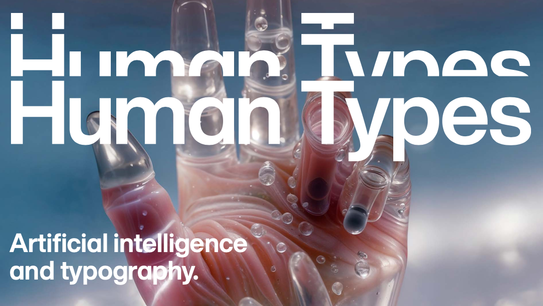
Human Types: Schrift im Zeitalter von KI
PAGE: Der zweite Trend, Human Types, beschäftigt sich mit Co-Creation und KI. Welche Rolle werden Typograf:innen in Zukunft spielen?
Charles: Genau das wollen wir mit dieser Aktivierung herausfinden. Unser KI-Team bei Monotype arbeitet an verschiedenen Tools und Prozessen, aber wir wissen selbst noch nicht genau, wohin das führt. Im Moment geht es vor allem darum, zu experimentieren und die richtigen Fragen zu stellen.
Phil: Typografie war schon immer von den Werkzeugen geprägt, die wir benutzen. Der Buchdruck hat alles verändert, genauso wie der Schritt ins digitale Zeitalter. KI ist einfach der nächste Schritt. Sie wird beeinflussen, wie wir Schrift gestalten und nutzen – aber sie wird das, was davor war, nicht auslöschen.
Charles: Im Moment stehen wir mit KI noch ganz am Anfang – wir probieren aus, testen, lernen. Aber in den nächsten Jahren könnte KI helfen, personalisierte Typografie zu entwickeln, die sich an individuelle Bedürfnisse anpasst und Sprach- sowie Kulturbarrieren überwindet.
Freedom, Law & Order: Welche Regeln sollten wir brechen?
PAGE: Der nächste Trend dreht sich um Freiheit, Gesetz und Ordnung. Gibt es eine typografische Regel, die wir 2025 öfter brechen sollten?
Phil: Ganz ehrlich? Ich wüsste nicht mal, welche Regeln es da genau gibt. Und falls doch: Brecht sie alle! Vergesst sie einfach.
Charles: Für mich geht’s eher um Zusammenarbeit. Man muss keine Regeln brechen, wenn man das ganze System infrage stellt. Lass ein Team den Anfang machen, ein anderes führt es weiter. Tauscht euch aus, probiert neue Arbeitsweisen aus. Vergesst den Gedanken, dass man Typografie nur dann »besitzt«, wenn man selbst die Buchstaben gezeichnet hat. Man kann auch Arbeitsprozesse, Entscheidungen oder Ideen »besitzen«.
Gleiches gilt auch im Umgang mit den Nutzer:innen. Wenn ihr etwas loslassen wollt, dann den Stolz, der oft mit Expertise einhergeht. Teilt euer Wissen, damit Menschen selbstbewusst eigene typografische Entscheidungen treffen können.
Life Cycle: Generationen verbinden
PAGE: Trends sind ja oft umstritten – besonders, wenn sie sich gegenseitig zitieren. Gen Z ist bekannt für ihren Hang zum nostalgischen Design. Wie seht ihr das?
Charles: Für mich sind Trends eher wie Rohmaterial. Momentan ist vieles tatsächlich nostalgisch, aber nicht im Sinne von »rückwärtsgewandt«. Eher wie eine neue Freiheit, aus der gesamten Geschichte des Grafikdesigns zu schöpfen. Und das liegt nun mal in den Händen der Digital Natives. Sie schaffen vielleicht ganz neue Erzählungen, die für diejenigen, die diese Ästhetiken damals erlebt haben, nicht „authentisch“ wirken. Aber genau dadurch entsteht etwas Neues.
Phil: Typografie ist immer ein Spiegel der Menschen, die sie gestalten. Im Bericht sprechen wir auch über den Generationenwechsel in der Designbranche. Die Daten zeigen: Schon bald wird die Design-Community deutlich jünger sein als ihr Publikum. Deshalb müssen wir jetzt lernen, generationenübergreifend zu arbeiten, damit am Ende kein riesiger Gap in der Art entsteht, wie wir kommunizieren.
Conflict & Peace: Typografie als kultureller Code
PAGE: Schrift wird je nach kulturellem Hintergrund sehr unterschiedlich wahrgenommen. Besonders nicht-lateinische Schriften sind oft mit Klischees behaftet. Wie können Designer:innen diese Stereotype aufbrechen?
Charles: Typograf:innen haben da eine besondere Perspektive, weil wir täglich mit globalen Schriftsystemen arbeiten. Wir sehen oft erst die Form der Buchstaben, bevor wir Sprache oder Kultur dahinter wahrnehmen. Aber wir müssen uns auch bewusst sein, wie unterschiedlich Schrift emotional auf der Welt wahrgenommen wird.
Phil: Was bei uns im Westen als modern und minimalistisch gilt, kann woanders als traditionell oder sogar altmodisch wirken. Stereotype zu brechen heißt, die richtigen Fragen zu stellen: Gestalten wir für eine globale Marke unterschiedliche Schriften je nach Region, um weltweit dieselbe Emotion zu erzeugen? Oder setzen wir auf ein einheitliches Design und nehmen in Kauf, dass es regional unterschiedlich ankommt?
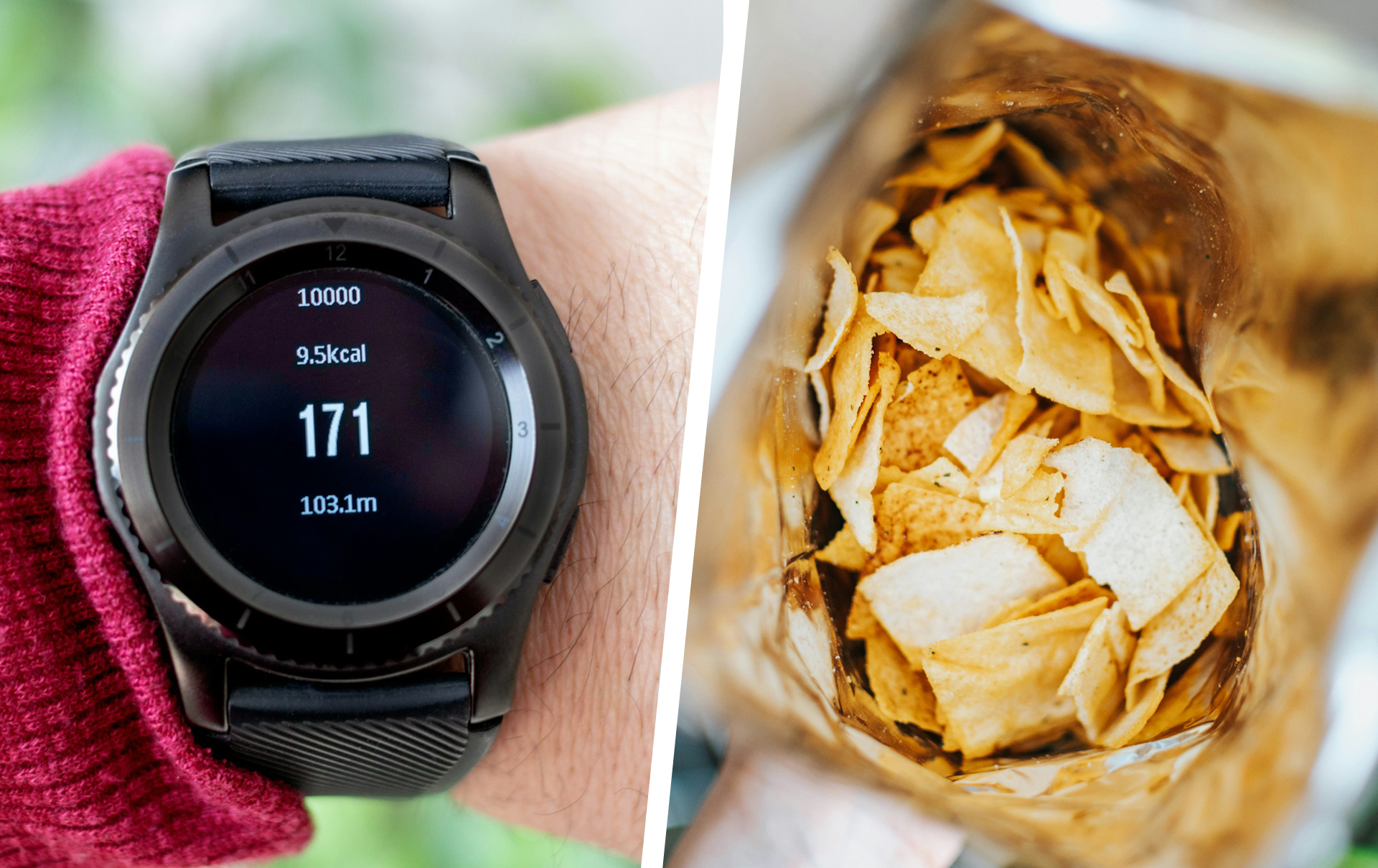
Hot & Wet: Nachhaltigkeit groß denken
PAGE: Die letzte Aktivierung 2025 dreht sich um den Klimawandel. Wie kann Typografie helfen, das Thema Nachhaltigkeit zu adressieren?
Charles: Das ist tatsächlich ein Thema, an dem wir mit einigen unserer größten Kund:innen arbeiten. Typografie selbst kann nur begrenzt etwas bewirken – es kommt darauf an, wie wir sie einsetzen.
Ich freue mich besonders auf diese Aktivierung, weil der Designer, mit dem wir hier kooperieren, direkt gefragt hat: »Wie groß darf ich denken? Können wir den Server wechseln, um Energie zu sparen?« Es geht also nicht nur darum, die Laufweite zu optimieren oder schmalere Schriften zu verwenden. Es gibt so viele kleine Hebel, an denen Typograf:innen drehen können.

Zum Schluss: Wie bleiben wir motiviert, die Welt zu verändern?
PAGE: Mit all dem, was gerade in der Welt passiert – wie bleibt ihr motiviert, Dinge zu verändern?
Charles: Eine unserer Partner:innen hat kürzlich gesagt: »Design bringt Freude in den Wandel.« Wir gestalten Dinge, die leben, atmen und jeden Tag genutzt werden. Wir haben eine enorme Macht, Veränderung nicht als etwas Belastendes, sondern als etwas Positives zu gestalten.
Phil: Veränderung und Erneuerung sind einfach ein grundlegender Teil von Kreativität. Genau deshalb stehen wir jeden Morgen auf und machen weiter. Wir iterieren, um etwas Besseres zu schaffen. Design kann diese Freude an Themen wie Nachhaltigkeit, Politik oder Information weitergeben.
Und Veränderung passiert Schritt für Schritt. Wir müssen nicht alles auf einmal umkrempeln. Es reicht, den ersten Schritt zu machen, die erste Linie zu ziehen, das erste Gespräch zu führen. Genau das wollen wir mit den Type Trends 2025 anstoßen.
Hier geht es zum vollen Type Trend Report 2025
English Orginal
A Mirror of Culture: the Monotype Type Trends 2025
Type has always been about more than aesthetics. It´s an expression of culture and communication. Which is why, in 2025 the Monotype Type Trends take on a new form: starting with a report on six world-changing topics and their relation to type, evolving into six activations throughout the year, in which Monotype collaborates with agencies and creatives to showcase the power of type.
We spoke to Executive Creative Director Director Phil Garnham and Senior Executive Creative Director Charles Nix about the shift, their vision for the type industry and the trend topics they´re looking to discuss with the design community.
From trend report to manifesto
PAGE: Let’s start with the report itself. How long have you been working on it?
Phil: It feels like three or four years! Back when Charles and I were working on the 2021 trends report, we noticed a shift. That report was still very curatorial, but we began to realize that typography was connecting more and more to brand design, strategy, and the broader cultural context.
Charles: That’s when we started compiling ideas. We created a shared document where we could collaborate and gathered stories and ideas stories. But I should add that while Phil and I are credited as authors, this was a team effort. As creative directors, we were more like guides – directing the team, cheering them on, and encouraging this new way of thinking.
For us, the report reflects a shift in how we see our mission as Monotype. We’re moving away from simply curating trends and instead stepping into a leadership role – really engaging with larger cultural and strategic forces.
So, it’s not just about trends anymore?
Charles: No – because trend reports often remain on a superficial level, and while they’re popular, they don’t dig deep. We felt a responsibility to create something with more depth. Something that connects the design community and the world beyond.
Phil: Also, we – as Designers – are strategic thinkers. It felt counterintuitive to look backward when we should be asking forward-facing questions. For example: »How can we influence world-shaping events? How can typography spark change?«
With this year´s report you are also introducing the idea of activations. How does the report tie into these events?
Charles: Think of the report as a starting point – the kicking and screaming phase of the year, if you will. It’s like a party invitation that introduces the main topics and questions we’ll be focusing on.
Phil: The activations are where we put these ideas into practice. They happen almost monthly and involve collaborations with creatives worldwide. This makes the report a living, breathing thing that evolves over time – even beyond just 2025 and into the next years.
Charles: The first activation, for example, focuses on multimedia and type. We’re collaborating with AudioSocket to explore how typography and sound can interact using AI. Without giving too much away, it’s about merging type and sound in ways that feel fresh and unexpected.
Sound and Vision: getting Type moving
PAGE: Sound and typography – that’s an unusual pairing. Isn’t type usually seen as a quieter design element?
Phil: True, but that’s exactly why we wanted to explore this. Typography is everywhere, but because we’re so used to it, we barely notice it anymore – even bold display type can feel quiet. With this activation, we’re thinking about how type interacts, moves, and evolves.
Charles: Type has a musicality to it. From micro to macro typography, there’s rhythm in letterforms and the act of reading itself. For Sound and Vision, we’re bringing together creatives from various disciplines to orchestrate something new. It’s about listening, adapting, and evolving ideas collaboratively. In a world where multimedia is the norm, type designers have to be part of that orchestra. It’s less about individual ownership and more about what we can achieve together.
Human Types: Type in the Age of AI
PAGE: The second trend, Human Types, looks at co-creation with AI. What role will type designers play in the future?
Charles: That’s exactly the question this activation is meant to explore. While our AI team at Monotype is working on various tools and processes, we don’t yet know what the outcome will be. For now, it’s about experimenting and asking questions.
Phil: Typography has always been shaped by the tools we use. Movable type changed everything, as did digital design. AI is just the next step. It will change how we create and use type, but it won’t erase what came before.
Charles: Right now, we’re in the toddler phase of AI – experimenting, playing, and figuring things out. But in the coming years, AI could help us create personalized typography that adapts to individual needs, breaking down language and cultural barriers.
Freedom, Law and Order: what Rules to break
PAGE: The next trend touches on freedom, law, and order. Is there a type rule that we should break more in 2025?
Phil: I´m not sure, I know the rules of type. And if you know any – break them all, forget them all.
Charles: I believe, it´s all about collaboration. You don´t need to break any rules, if you break the box. Let one team make a start and the other keep working on it. Exchange ideas and ways to work. Let go of the idea, that the only way to have ownership of type is to be the one making the splines. You can own choices and ideas, or a way to work.
Same goes for interaction with our users. If you want to let go of anything, let go of the arrogance that comes with your expertise and start sharing, so that people can be empowered to make their own typographic decisions.
Life Cycle: bridging generations
PAGE: Trends are very controversial sometimes – especially when they reference each other. Gen Z is famous for their nostalgic design. What´s your take on that?
Charles: For me, trends are more of a raw ingredient. And right now, most of them are really nostalgic, but not in a backward way – more like a freedom to curate from all of graphic design´s history. Which, by nature, is in the hands of the digital-first generations. They might set a completely new narrative, which might not be purist enough for the people who lived it. But it will be something new.
Phil: Type is also always a product of the people working on it. In the report we also touch on the generational change in the design industry – looking at the data you can see, that in the near future the group of designers will be far younger than their audience. So, we need to start learning to work together now, so we don´t end up with a gigantic gap between our styles of communication.
Conflict and peace: understanding culture
PAGE: Type can be perceived very differently, depending on the recipient´s cultural background. Lots of non-Latin scripts come with stereotypes. How can designers break those perceptions?
Charles: Typographers are in a unique position because we work with global scripts every day. We see letterforms before we see language or culture. But we also need to be aware of how scripts are emotionally received around the world.
Phil: For instance, what we see as modern and minimalist in the West might feel traditional or outdated elsewhere. So breaking Stereotype is all about asking the right questions: Do we design different fonts for the same brand depending on the region, because we want to create the same emotion world wide? Or do we stick with one visual output but risk the brand coming across differently?
Can type itself be political?
Charles: Type in itself starts out neutral, but it can become associated with a specific political message, once it´s used for it often enough. There is a language of protest, and some specific typefaces associated with it.
Phil: That´s a great question, because it invites the discussion, if type gains expression on it´s own, or through the intentionality and the use. I believe, it´s us as designers who can make type political by declaring them to be or allowing them to be used for certain projects.
Hot&Wet: Sustainability on a bigger Scale
PAGE: The final activation for 2025 is about climate change. How can typography help address sustainability?
Charles: That is something we´re working on with some of our biggest clients. Type in itself can only do so much – it´s mostly about how you use it.
I am really excited for the activation on this one. Because the designer we´re collaborating with, immediately asked »How big can I go? Can we move to a green server?« It´s not just about line spacing and using a condensed font to save space – there are so many small levers for typographers and designers to use.
That´s a great gateway to our final questions. How, with everything that is happening in the world, do we keep being motivated for change?
Charles: One of our partners reminded us recently that design brings joy to change. We create things that live and breathe and get interacted with daily. We have immense power to make change something that´s not dreaded but celebrated.
Phil: There is a fundamental creative satisfaction in change and renewal. It´s the reason we get up and do it again, the reason that we iterate to create something better. And design can bring this sort of joy to topics like sustainability and politics and information.
And change happens incrementally. So really, we don´t need to be motivated to change everything tomorrow, but to take the first step, draw the first line, get people talking and acting. Which is what we are hoping to do with this year´s type trends.
Head to the full Type Trend Report 2025